Quantcast
Channel: Logo Guidelines – The Logo Smith
Viewing all 114 articles
Browse latest View live

Interbrands Top 50 Global Green Brands of 2013

$
0
0

Interbrands Top 50 Global Green Brands of 2013

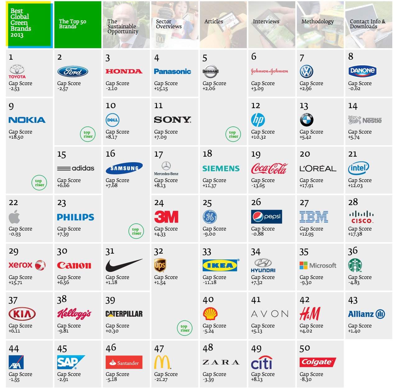
This is really interesting viewing/reading if you are interested in what brands/companies are doing their bit for our environment. Interbrand have created this dynamic Top 50 list that allows you to see information relative to each brand, and their commitment to adopting ‘greener’ technologies and work practices.

Specifically, it’s about sustainability: defined as an ongoing effort to improves the quaity of human life while living within the limits of supporting ecosystems.

For Interbrands top Top 50 Global Green Brands of 2013, sustainability is defined as: “…business approach to creating long-term value by embracing opportunities and managing risks derived from economic, environmental, and social impacts. In a commercial sense, sustainability also involves creating and maintaining a product, service, or business identity that reflects special added value in terms of environmental and social benefits. Sustainability has proven to be a strategic and profitable aspect of business and a brand-strengthening asset, as long as organizations take measurable steps to reduce their social and environmental impact and credibly convey benefits that are relevant to consumers.”

It’s definitely worth checking the first row of boxes as these provide essential information that allows you to put the results all into context.

» Source: Interbrand

Read Interbrands Top 50 Global Green Brands of 2013 on The Logo Smith - logo & brand identity design portfolio and blog.


The AutoNetwork Logo Deconstructed

$
0
0

the autonetwork logo deconstructed

You can see a larger version here: http://www.flickr.com and here: http://imjustcreative.com/work/the-auto-network-logo/

The lines, arrows, circles in the logo above, for The AutoNetwork, show important areas of balance, vertical and horizontal alignment, as well as intersections of key areas of the logo.

Where ever possible, and if it’s not to the detriment of the logo designs aesthetics, I will design in all these various alignments and intersections in order to bring harmony and interconnectedness within the logo.

The circles show key areas of vertical, diagonal and horizontal intersections and alignments, the vertical arrows generally show where space is ‘equally halved’ once then twice, usually relating to type baselines, ascenders and/or descenders in relation to the contained logomark.

For example the ‘a’ in the circle has a middle point that aligns with the x-height of ‘autonetwork’, which half of the x-height is equal to half the width of the a’s thickness, then half of that is equal to the bottom portion of the types’ counters in letters such as the: a, u, o etc


Read The AutoNetwork Logo Deconstructed on The Logo Smith - logo & brand identity design portfolio and blog.

Typographic Felt ‘Letters Coasters’ by Little Factory

$
0
0

letter_coaster_05

Still using the carved typographic wooden coasters that Veer sent me a while back, but I still find myself wondering near the ‘Add to Basket’ button for these marvellous laser cut felt Letters Coasters by Little Factory.

Each coaster is 11.5×11.5cm in size made from 100% polyester felt, and it’ll cost you only $12 for the 4-piece set!

They also do  accompanying Numbers Placemats for the best dining experience.

» Source: Little Factory
» Via: Typography Daily

Read Typographic Felt ‘Letters Coasters’ by Little Factory on The Logo Smith - logo & brand identity design portfolio and blog.

Updated Monomarks (Techniblack logomarks) from Graham Smith

$
0
0

Monomarks by Graham Smith

Keeping ones portfolio up-to-date nearly always seems to be one of those tasks that just keep getting side-lined due to this and that. One really needs to get his finger out of his backside more often.

Finally had to scratch a certain itch, so took the last few days to revise my Monomarks:

Monomarks: individual logomarks, from each of my logo designs, displayed in glorious Techniblack.

Previously they were black logomarks on a dark grey background, which frankly was most dull. The new Monomark’s are now square and have the black logomarks on a brilliant white background.

I’ve yet to fully update the Monomark page, here on this website, with all the new updated Monomarks, but you can see a long list of them over on my new Behance Prosite external portfolio: http://grahamsmith.info as well as on Flickr.

Screen Shot 2013-07-29 at 12.28.36

For the hell of it I’ve uploaded them all to this post below:

Love Ampersand Monomark (W) designed by imjustcreative ZuluSafari Monomark (W) designed by imjustcreative Cranked Monomark (W) designed by imjustcreative The House Monomark (W) designed by imjustcreative Viva Chocolate Monomark (W) designed by imjustcreative Tamara Kauffman Monomark (W) designed by imjustcreative My Modern Mix Monomark (1) designed by imjustcreative My Modern Met Monomark (w) designed by imjustcreative CrowdSupport Monomark (w) designed by imjustcreative KeyboardKahuna Monomark (w) designed by imjustcreative Cranked Bike Shop logo designed by imjustcreative Love Ampersand Monomark (W) designed by imjustcreative AWS Monomark (W) designed by imjustcreative LoveHug Monomark (W) designed by imjustcreative Frictn Monomark (w) designed 1 by imjustcreative Rosey Bee Monomark (W) designed by imjustcreative Deskpro Monomark (W) designed by imjustcreative DP Monomark (W) designed by imjustcreative Shark Monomark (W) designed by imjustcreative Molesey Inc Monomark (W) designed by imjustcreative Sifter Monomark (W) designed by imjustcreative TFW Monomark (W) designed by imjustcreative Leaf Medical Monomark (W) designed by imjustcreative 2 Column Design Monomark (W) designed by imjustcreative Rebase Monomark (W) designed by imjustcreative T-shirt Express Monomark (W) designed by imjustcreative Working House Monomark (W) designed by imjustcreative NAA Monomark (W) designed by imjustcreative Feedly Monomark (W) designed by imjustcreative TMO Monomark (W) designed by imjustcreative Selective Few Monomark (W) designed by imjustcreative The Auto Network Monomark (W) designed by imjustcreative Bluecoat Monomark (W) designed by imjustcreative Hotel Maison Monomark (W) designed by imjustcreative Harbour Originals Monomark (W) designed by imjustcreative Illumina Wedding Photography Monomark (W) designed by imjustcreative orb Web Solutions Monomark (W) designed by imjustcreative Hiroko Monomark (W) designed by imjustcreative Starpuff Monomark (W) designed by imjustcreative Apple & Eve Monomark (W) designed by imjustcreative Wavepulse Acoustics Monomark (W) designed by imjustcreative Brokers Direct Monomark (W) designed by imjustcreative Swisstap Monomark (W) designed by imjustcreative Smashing Magazine Monomark (W) designed by imjustcreative Copy Pastel Monomark (W) designed by imjustcreative Rock Couture Monomark (W) designed by imjustcreative Unholy Ladies Undergarments Monomark (W) designed by imjustcreative Hotel Chain Monomark (W) designed by imjustcreative ID barbers Monomark (W) designed by imjustcreative JoomlaBamboo Monomark (W) designed by imjustcreative BSA Monomark (W) designed by imjustcreative Abacus Insurance Monomark (W) designed by imjustcreative DemandCue Monomark (W) designed by imjustcreative Damien Hottelier Monomark (W) designed by imjustcreative CamCode Global Monomark (W) designed by imjustcreative ADXPRS Monomark (W) designed by imjustcreative grape Monomark (W) designed by imjustcreative ipepcare Monomark (W) designed by imjustcreative Harvest Bible Church (W) Monomark designed by imjustcreative Friction Factory Monomark (W) designed by imjustcreative Black Vanilla Monomark (W) designed by imjustcreative Pedalworks Monomark (W) designed by imjustcreative Pure Storage Monomark (W) designed by imjustcreative Foehn & Hirsch Monomark (W) designed by imjustcreative Monochrome Monomark (W) designed by imjustcreative Tom & Teddy Monomark (W) designed by imjustcreative Stylised S Logomark for sale


Read Updated Monomarks (Techniblack logomarks) from Graham Smith on The Logo Smith - logo & brand identity design portfolio and blog.

Selection of Masterful Logo Designs by Bluerock Design

$
0
0

I have long been a fan of the work produced by Bluerock Design with a few of theirs being posted to Logo Stack: real world logo design inspiration.

However, it seems that I had missed the true awesomeness of their collective output due to only recently seeing all their logo designs up on their Behance profile. They really know how to pull off that semi modern vintage feel, using really distinct fonts for the main brand wording, along with some really nice, and carefully used, imagery.

Feast your eyes on this lot (more over on their website and Behance):

Logos by Bluerock Design Logos by Bluerock Design Logos by Bluerock Design Logos by Bluerock Design Logos by Bluerock Design Logos by Bluerock Design Logos by Bluerock Design Logos by Bluerock Design Logos by Bluerock Design

Read Selection of Masterful Logo Designs by Bluerock Design on The Logo Smith - logo & brand identity design portfolio and blog.

The ADXPRS Logo Animated

$
0
0


God, how I love it when one of my logo designs is actually brought to life through some form of animation. It really quite a buzz to see all that hard work actually coming to life.

My first logo to be animated was a brilliant promotional video for for Feedly, and now I’be just got my hands on a short segment of a promo video that shows my ADXPRS logo flying into shot.

ADXPRS Logo foundation

ADXPRS Logo Evolution ADXPRS logo design by imjustcreative


Read The ADXPRS Logo Animated on The Logo Smith - logo & brand identity design portfolio and blog.

Type Hero #7: Korpo Serif designed by Mateusz Machalski

$
0
0

Korpo Serif, designed by Mateusz Machalski 3

Korpo Serif, designed by Mateusz Machalski 1 Korpo Serif, designed by Mateusz Machalski 2 Korpo Serif, designed by Mateusz Machalski 4

Another fab sale offer, on MyFonts, for Korpo Serif, designed by Mateusz Machalski. You can currently pick up this serif type family, consisting of 10 weights, for just $30 instead of $150:

MyFonts on Korpo SerifKorpo Serif, designed by Mateusz Machalski, is a serif type family with a friendly feel. Serif style brings to mind egyptian or slab styles. This type contains 10 variants with two different “a” ang “g” glyph per style. Korpo contain Small CAPS in two styles. Broken details were made intentionally for better readability. The low contrast and high x height is perfect for longer text and Headlines.

Tend to find that finding a serif font that I like is usually quite tricky. There are plenty to choose from, but I have quite a specific idea of what a good, useable and versatile serif, espeically for logo designs, is thus it’s great when one surfaces like Korpo Serif. It has some presence, not too spindly or narrow, feels welcoming as well as having strength. Ticks all the boxes for me, and I’ve just downloaded it for a new logo project I’m currently working on.

Buy Korpo Serif, by Mateusz Machalski, for $30.

Type Hero for Logo Designers

Type Hero is where I pick out certain fonts and typefaces that I find particularly cool. For the most part the font choices will be geared towards styles that I feel could work well in a logo design.

MyFonts has become a steady source of font inspiration, so many will be sourced from there, but I will also highlight fonts direct from font foundries when possible.

I also have or have recently purchased all Type Hero fonts, so I am talking the walk and walking the talk.

Read Type Hero #7: Korpo Serif designed by Mateusz Machalski on The Logo Smith - logo & brand identity design portfolio and blog.

Carhartt Logotype WIP Process by Sergey Shapiron

$
0
0

Carhartt-WIP process by Sergey Shapiro 1

Carhartt Logotype WIP Process by Sergey Shapiron

Really enjoy studying these marvellous hand-drawn lettered sketches for Carhartt, by Sergey Shapiron. These have not been designed to replace the main Carhartt brand logo, but for an upcoming 2014 collection.

Sergey Shapiron: “Some of hand drawn/written sketches I did while working on a new t-shirt design for Carhartt-WIP 2014 collection. All sketches are scanned without any further tweaks done.”

Quite a variation in lettering styles with some being far less readable than others, but as it’s all exploratory work one has to take design to the limits in order to fully assess your ‘window of opportunity’, so-to-speak.

I have only selected a few of the Carhartt sketches, but there are loads more over on Sergey’s Behance profile.

Carhartt-WIP process by Sergey Shapiro 3 Carhartt-WIP process by Sergey Shapiro 4 Carhartt-WIP process by Sergey Shapiro 5 Carhartt-WIP process by Sergey Shapiro 6 Carhartt-WIP process by Sergey Shapiro 7

Carhartt-WIP process by Sergey Shapiro 9 Carhartt-WIP process by Sergey Shapiro 10 Carhartt-WIP process by Sergey Shapiro 11 Carhartt-WIP process by Sergey Shapiro 12 Carhartt-WIP process by Sergey Shapiro 13 Carhartt-WIP process by Sergey Shapiro 14

Carhartt Logotype WIP Process by Sergey Shapiron


Read Carhartt Logotype WIP Process by Sergey Shapiron on The Logo Smith - logo & brand identity design portfolio and blog.


Sketching Whilst on a Frustratingly Tiresome Hold with BT Helpline

$
0
0

Logo Sketches

After having my BT Broadband upgrade to BT Infinity brilliantly ballsed up by a BT contractor, leaving me with no broadband at all, I ended up having to making a number of horrifyingly frustrating calls to BT’s abysmal call service hotlines.

The calls to BT started at 6pm Monday evening, and after 4 separate calls, and talking to 6 different people in various parts of the world, I gave up the will to live at 11pm being no better off in getting my broadband up and working.

However, all this time on hold and listening to scripted questions, I ended up sketching some ideas for a logo project I’m currently working on. The one with the frame has a nice symmetry as the P and G are/would be the exact same form, just flipped vertically, with the H sitting behind, but gelling all 3 initials: PHG, together. It’s a little more interesting that just having 3 regular initials, and basically does become a logomark in it’s own way. It could be used independently of the full length typemark; Pleasant Hill Grain, for example, rather than being a regular logomark that typically always forms part of the whole logo.

I think twiddling my thumbs would have left me close to wanting to commit a terrible act upon myself to avoid the ongoing misery, but the doodling actually proved to be very soothing and actually actually lead to a decent idea to pursue further. Hadn’t previously seen that the P & G could be formed from the same shape thus creating a reasonable solid, and quite unique initialmark

Not sure what the moral is of this tale, but maybe always have a pen and some paper handy should you ever find yourself stuck in an infinite loop of BT helpline hell.


Read Sketching Whilst on a Frustratingly Tiresome Hold with BT Helpline on The Logo Smith - logo & brand identity design portfolio and blog.

Arial vs. Helvetica by OKFocus

$
0
0

arial-vs-helvetica


If you think this animated GIF showing the differences Arial and Helvetica is a little hard on the eyes, then you ain’t seen nothing yet. Dare you to click on the main image below… I mean seriously, have plenty of aspirin ready, and if you are epileptic, I would advise caution!

We can thank the people over at OKFocus for putting this educational typographic mini-site: Arial vs Helvetica, together.

» Via: The Fox is Black
» Source: OKFocus

Screen Shot 2013-09-06 at 11.35.28

Read Arial vs. Helvetica by OKFocus on The Logo Smith - logo & brand identity design portfolio and blog.

Animated Famous Brand Rivalries by Rodolfo Foitinho

$
0
0

656ddf9084f46f6bb938d6a9fa55ada7

coke pepsi brand rivalries


The Greatest Brand Rivalries is quite a cool brand project by Rodolfo Foitinho. Found it whilst checking out the Behance galleries for anything new for Logo Stack.

I was a little unsure at first, but scanning down his list of brands made me realise just how similar, in shape in a lot of cases, each brand item is. Yet, they can significantly vary in quality, perceived coolness etc. Just the overlapping of these shapes makes you realise how undifferent some brands really are when it comes right down to it. Obviously, in some cases, one brand got to design a unique form factor first, then the others follow suit, but in some cases the overall form just hasn’t changed in decades.

View more: The Greatest Brand Rivalries over on Rodolfo‘s Behance page.


e22034b57868f7dfb272a88d33f36e8d

12c56f5dbf72340b78322d0f6f86fa7c


428c40ebb581c2cb812adde0d0c3ffd3

1cf9901bd650aa659836c08c7f674159

43e97e202f6a1657db506c83fcccf8fd

Read Animated Famous Brand Rivalries by Rodolfo Foitinho on The Logo Smith - logo & brand identity design portfolio and blog.

Taking on New Logo Design Briefings

Mentioned: The Auto Network Logo Redesigned

$
0
0

Screen Shot 2013-09-12 at 18.35.27


Really nice to see the fruits of ones logo design work, The Auto Network logo, proudly adorning the header of the redesigned/updated website. Also a quick thank you to Rebecca Turnbull for the mention in their blog post: New branding for a new direction, The Auto Network works with Graham Smith

During the initial, and last, stages of the logo development I didn’t really have a clear idea of how their website would be redesigned and updated. This is quite a common way of working, at least for me, so it’s just really nice to see how the logo and website now seem to really gel quite nicely. The favicon looks pretty neat as well!


auto network header

the autonetwork logo deconstructed

You can see a larger version here: http://www.flickr.com and here: http://imjustcreative.com


Read Mentioned: The Auto Network Logo Redesigned on The Logo Smith - logo & brand identity design portfolio and blog.

NASA’s ‘Worm’ Logo Animated in 70′s Groovy Fashion

$
0
0

NASA worm logo animated

Not sure I’ve seen something this cool in ages. What could be more cooler than seeing the remarkably cool NASA ‘worm’ logo spinning into position like some 70′s take on travelling through a groovy wormhole whilst stoned.

Don’t leave without also checking out: NASA Identity Design Program

» Via: http://unifiedpoptheory.com/vintage-1977-nasa-video-talks-about-voyager/
» Source: Aeronautics And Space Report 1977

Two more animated NASA logos (below) from: It’s OK To Be Smart

NASA's 'Worm' Logo Animated in 70's Groovy Fashion

NASA's 'Worm' Logo Animated in 70's Groovy Fashion

Read NASA’s ‘Worm’ Logo Animated in 70′s Groovy Fashion on The Logo Smith - logo & brand identity design portfolio and blog.

Barbican Visual Identity Guidelines Book Designed by North

$
0
0

BARBICAN VISUAL IDENTITY GUIDELINES

Barbican Visual Identity Guidelines Book Designed by North

North has created the new Barbican visual identity guidelines book, to mark the start of the AGI Open: the annual international graphic design event which is being held at the Barbican for its inaugural London edition.

This is a sneek peek of the book which will be launched as a limited edition downloadable PDF on 23rd September.

Collate: ”The latest iteration of the guidelines have been developed in collaboration with the AGI member North, a design agency who have worked with the Barbican for over a decade to continually develop its visual identity in parallel with the evolving needs of the Centre’s vision and programme. The limited edition book will be available to purchase for £20 from the Barbican Shop, the Graphic Design Book Shop (26-27 September only as part of the AGI Open) and online here.”

Sources: [barbican.org.uk] [northdesign.co.uk] [Collate]

BARBICAN VISUAL IDENTITY GUIDELINES1c BARBICAN VISUAL IDENTITY GUIDELINES 1b BARBICAN VISUAL IDENTITY GUIDELINES 1a BARBICAN VISUAL IDENTITY GUIDELINES 1f BARBICAN VISUAL IDENTITY GUIDELINES1g BARBICAN VISUAL IDENTITY GUIDELINES 1h

Read Barbican Visual Identity Guidelines Book Designed by North on The Logo Smith - logo & brand identity design portfolio and blog.


Born Humanist Typeface-Free Download Designed by Carlos de Toro

$
0
0

banner-ancho-born-en2

Carlos de Toro emailed me with a lovely little note and a link to his website, more specifically a link to his gorgeous typeface, named Born. Carlos has clearly spent a lot of time, and put in a lot of love in the development and creation of his typeface, yet with all that Carlos is making Born a free download, but donations ARE obviously warranted I think.

In his words:

Carlos de Toro: “Born is much more than a typeface, it’s also a story; The one of my 2013. A story about moving to the big city, the result of meet great people from all parts of the world and their cultures too, the result of talks in classes, bars and trains… the result of sharing moments, experiences, knowledges… Born is the result of all these experiences and people: and now I’m sharing with you this piece of my story.

Specimen-Born-typeface-tipografia2

About Born

Born is a humanistic typeface that is based on traditional calligraphic forms, but with some new features in its endings, strokes and drops, that provide a more open, fresh and actual look. It also has a big X height, so it offers a high legibility even at small sizes.

Born typeface, born in Barcelona city at early 2013, bears the name of one of the most picturesque Barcelona districts, on the shores of the Mediterranean takes together the old and the traditional, and also the multicultural stuff and new trends, blending these in its narrow and winding streets, creating a symbiosis between tradition and modernity. This is a Mediterranean type, which it’s open to new times.

Born Includes

Regular Born includes a total of 262 glyphs: Uppercase, Lower case, Alternative glyphs of the above ones, normal Ligatures, Uppercase numerals and symbols and punctuation marks.

Specimen-Born-typeface-tipografiaSpecimen-Born-typeface-tipografia5 Specimen-Born-typeface-tipografia3 Specimen-Born-typeface-tipografia4

Read Born Humanist Typeface-Free Download Designed by Carlos de Toro on The Logo Smith - forging logomarks of distinction since '86.

Irina Blok Designed That Android Logo

$
0
0

android logo

I’ve always loved that cutesy Android logo, it’s one of the most distinct logos used by any communications brand that I know. Not only is it cute, but it’s supremely simple, ultimately flexible, and transcends the digital world into the real world effortlessly.

Who Made that Android Logo: a nice little article by The New York Times describing the humble beginnings of the Android logo, but one that didn’t make the designer, Irina Block, particularly famous at all.

Irina Blok may have drawn one of the most recognised logos in the world, but her association with the green Android has not made her famous. Blok can think of only one incident when she garnered the public’s attention for designing it. In 2010, she and her 6-year-old daughter were in a movie theater waiting for “Alice in Wonderland” to begin when an Android logo flashed on the screen. Her daughter, Blok recalls, suddenly stood up and yelled, “My mommy invented that!” Everyone in the row in front of them turned around to stare. Blok was so embarrassed, she says, that she sank down behind her tub of popcorn.

Read Irina Blok Designed That Android Logo on The Logo Smith - forging logomarks of distinction since '86.

Design Jargon Bullshit – A Tumblr

$
0
0

Design Jargon Bullshit

Fantastically funny Tumblr full of Design Jargon Bullshit. Some of these are just unreal, some are simply hilarious.

I think the less the logo/design actually relates to the brief, then the more colourful the bullshit becomes. I’m gonna die if I find one of my bullshit statements in here!

A sample:


» Via: The Fox is Black
» Source: Design Jargon Bullshit

Read Design Jargon Bullshit – A Tumblr on The Logo Smith - forging logomarks of distinction since '86.

Various Animated Logo Evolutions by Nick DiLallo

$
0
0

http://youtu.be/H5LIuf9mFEs

 
Just absolutely loving these animated logo evolutions by Nick DiLallo over on YouTube. Nick has animated the following brand logos for your entertainment: American Airlines, Starbucks, UPS, GAP (the funniest), Apple (love hearing those system sounds again!) and NBC.

Giving what’s happened in the world of the JCPenny logo, would love to see the back and forth with that one as well.

They’re not truly animated, as in the sense of morphing one logo version to the other, but I totally love this humorous take on them instead!

Probably worth subscribing to Nick’s YouTube page incase he releases any more!

» Via: BrandNew
 

http://youtu.be/dhW9Uvy6eZo


http://youtu.be/AiIv6ZBYbIw


http://youtu.be/XXLCO5E3MC0


http://youtu.be/txdpX-2b3qA


http://youtu.be/dXXHZDmbHPE

Read Various Animated Logo Evolutions by Nick DiLallo on The Logo Smith - forging logomarks of distinction since '86.

You’re “Probably” Not a Brand Designer

$
0
0

A must read article by Adrian Shaughnessy; “Why designers should give branding back its soul”, is a useful article of how the very definition of Brand and/or Branding, has lost it’s true meaning to many, including designers.

I’ve touched on this in the past, and it generally resulted in somewhat heated debates on Twitter, but typically the word Brand is used pretty liberally, and rarely in the correct way.

Unfortunately, Brand has become synonymous with logo and identity design, so if you are a logo and identity designer, it’s almost become necessary to append the word to ones job title/description because it’s a term that is used by customers/clients in their search for a logo and brand identity designer.

It’s also just a term that has infused itself into the logo and identity terminology over the last few years, to the point many designers incorrectly believe they can design a Brand. Adding it to your job description is, for a lot of us, simply playing a little fast & loose with the definition for the sake of being found, and hired, and milking Google SEO for all that you can.

There is also something quite complete about how Logo & Brand Identity sounds, but still doesn’t make you a Brand designer.

Even in my case, where I often describe what I do as being a logo and brand identity designer, I’m not comfortable with using the word because it’s simply inaccurate. I don’t create brands, I create logo and identities, as these are the aspects I have control over. What I don’t have control over, or experience in, is branding. My primary area of focus is designing logos/logomarks whilst carefully, and considerately, venturing into the realm of identity design, ergo I’m a Logo & Identity Designer.

Obviously there are specialist companies/agencies that focus on the much bigger, complex, mysterious area of: product, company and personal Branding, but for many a self-employed logo & identity designer, it is simply not a valid part of the job description.


Read You’re “Probably” Not a Brand Designer on The Logo Smith - forging logomarks of distinction since '86.

Viewing all 114 articles
Browse latest View live


Latest Images