Quantcast
Channel: Logo Guidelines – The Logo Smith
Viewing all 114 articles
Browse latest View live

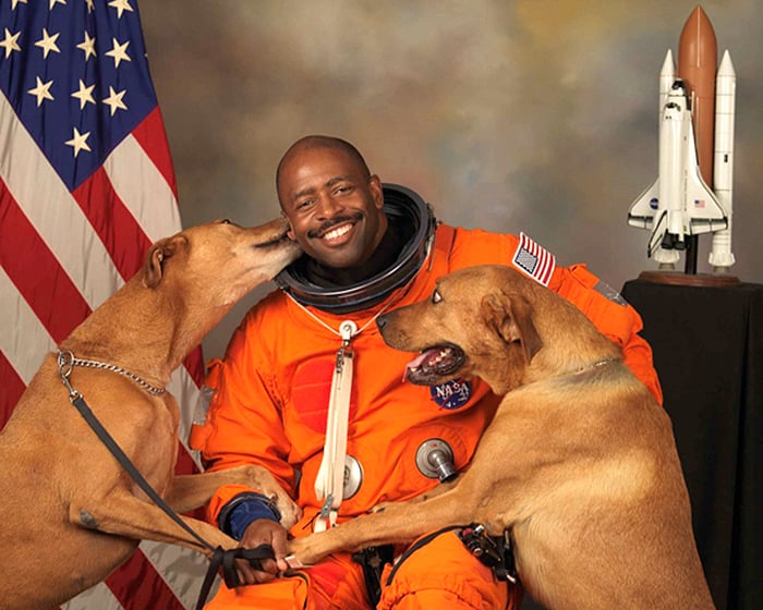
NASA Astronaut Leland D Melvin With Dogs Jake and Scout

$
0
0

NASA astronaut Leland D Melvin with his dogs Jake and Scout

This photograph of NASA astronaut, Leland D Melvin with his dogs Jake and Scout, just brings so much joy to my heart! Being a dog lover, I can just feel the excitement, the love and the happiness both Leland, Jake and Scout are all feeling.

Just look at Leland’s smile, then Scout’s eyes nearly popping out of his sockets.

Just beautiful.

» Found via: d


Read NASA Astronaut Leland D Melvin With Dogs Jake and Scout on The Logo Smith - forging logomarks of distinction since '86.


Abstract in Logo Design

$
0
0

Chase logo design

There really is quite a challenge behind designing a logo mark that is based on the abstract, rather than a more defined visual link to ‘entity’ one is creating a logo for.

Can’t say I get many clients actually asking for an abstract logo, and I’m pretty sure that’s simply down to a misguided notion that it’s a easy and quick ay for a designer to say ‘job done’, and with that a clear lack of value for money. If the client can’t say, “what does that logo have to do with my business? Nothing? Then why the hell do I want a logo that communicates nothing meaningful?”

Of course, that’s all poppycock. An good abstract logo is neither quick nor easy, and neither should a client dismiss the option of an abstract logo as being poor value for money. A client isn’t just forking out dosh for some hired help, they are paying for expertise, wisdom, and creative confidence to make decisions that a client is not in a position to make. One of those decisions might just be related to going with a logo design of an abstract nature, if they feel this is the best direction to take after dismissing more literal/obvious routes.

In this great article: To Abstract Or Not Abstract? looks at abstraction in logo and brand identity design, as well as other principles of identity design created by his firm, Chermayeff & Geismar & Haviv.

Tom Geismar saided to , “Since we did an abstract symbol for Chase, many have tried to do it in cases where they shouldn’t have.”

If we are doing our job as designers, our solution should always grow out of a well-thought-out strategy, and an abstract symbol is only one possible tactic among many.

Conservation International logo design

Read Abstract in Logo Design on The Logo Smith - forging logomarks of distinction since '86.

The Rio 2016 Olympic Pictograms

$
0
0

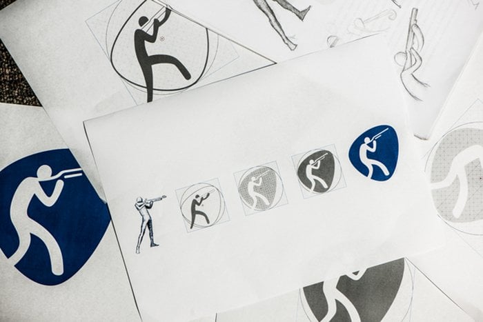
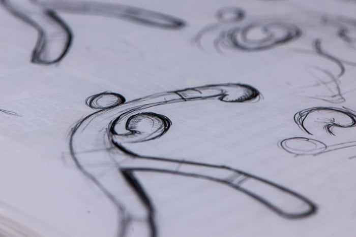
rio 2016 olympic pictograms sketches 2

rio 2016 olympic pictograms sketches 2 rio 2016 olympic pictograms sketches 2

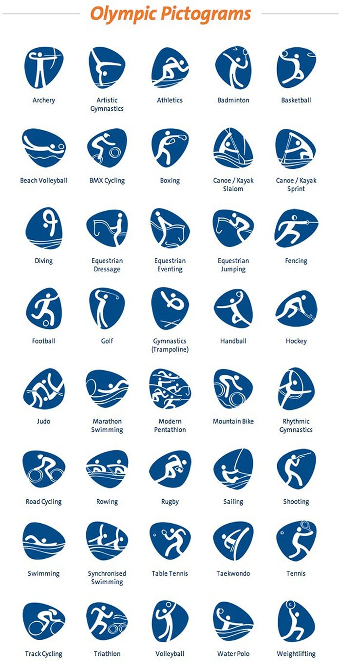
From the Rio 2016 website:” Sport pictograms are graphic icons facilitating the visual identification of each sport and are a Games tradition. In 2016, each Olympic and Paralympic sport will be represented by a unique pictogram for the first time. The Rio Games have 64 pictograms – 41 Olympic and 23 Paralympic – and you can check them out below. Also see our image gallery of the creative process for the pictograms, learn about the origin of this tradition and share your favourite ‘picto’!”

These bouncy Olymoic pictograms for the upcoming Rio 2016 games were designed in-house, by the Rio 2016 design team. They were ultimately influenced from the custom made Olympic typeface which was designed by Dalton Maag, which was itself based on the original Rio Olympic logo.

Although not a style I’m particularly fond of, they do, however, work perfectly within the entire Rio brand identity. They look and feel perfectly at home, and each pictogram seems to clearly represent each sport etc.

Creative Review has a detailed walk-through on the Olympic pictograms: Rio 2016 Olympic pictograms unveiled

rio 2016 olympic pictograms 1

rio 2016 olympic pictograms 1


Read The Rio 2016 Olympic Pictograms on The Logo Smith - forging logomarks of distinction since '86.

The Typography Primer – Free PDF Download

$
0
0

The Typography Primer by Adobe

A lovely little, and useful, publication covering the basics of typography from Adobe. It was actually first published waaaay back in the day, circa 2000, but the contents are still very relevant over a decade later.

From Adobe’s blog post: “This primer was written back in 2000, but its content is still relevant today. It talks about things like using the right character, choosing and using typefaces, combining typefaces in a publication, and loads of other interesting typographic tidbits. If you follow our blog, you probably already know a lot about type. If that’s the case, why not take a look inside anyway? Think of it as a fun refresher when you need a break from work. Perhaps it’s even something you might share with a co-worker who longs to know more about the mysterious world of x-heights and optical sizes.”

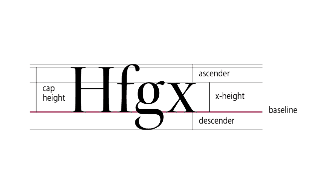
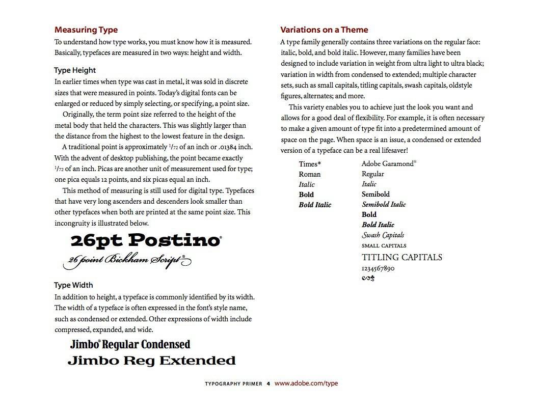
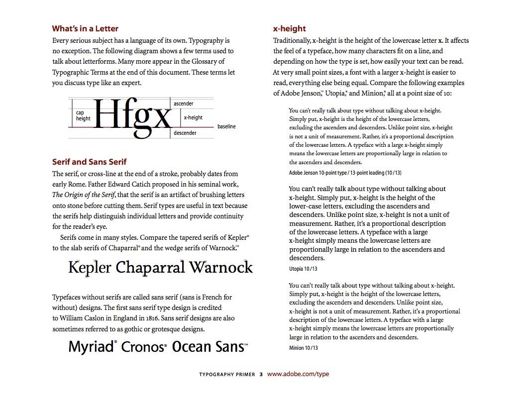
Download the Typography Primer (few page grabs from the primer below)

The Typography Primer by Adobe The Typography Primer by Adobe The Typography Primer by Adobe

Read The Typography Primer – Free PDF Download on The Logo Smith - forging logomarks of distinction since '86.

Unsplash – Free Hi-Resolution Photographs

$
0
0

Unsplash – Free Hi-Resolution Photographs

Unsplash Tumblr – Free (do whatever you want) Hi-Resolution Photographs made by ooomf.com

Absolutely in love with Unsplash: finding myself coming back to the site several times a day just to check out the existing photographs even knowing it’s updated every ten days.

Hat tip to Ben Garratt for pointing me to the site.

Such a variety of photographic styles, and content, that you’ll almost certainly find something of value. As far as Tumblr websites go, this one is pretty special.

I have used a number of these as backgrounds to some logo designs, for both my portfolio and for client presentations. A recent example of a logotype idea I presented to a client:

Unsplash Photo Example

Some Classy Examples

Photograph Photograph Photograph Photograph Photograph Unsplash Photograph Unsplash Photograph Unsplash Photograph Unsplash Photograph Unsplash Photograph

Read Unsplash – Free Hi-Resolution Photographs on The Logo Smith - forging logomarks of distinction since '86.

Helvetica The Perfume: The Scent of Nothing

$
0
0

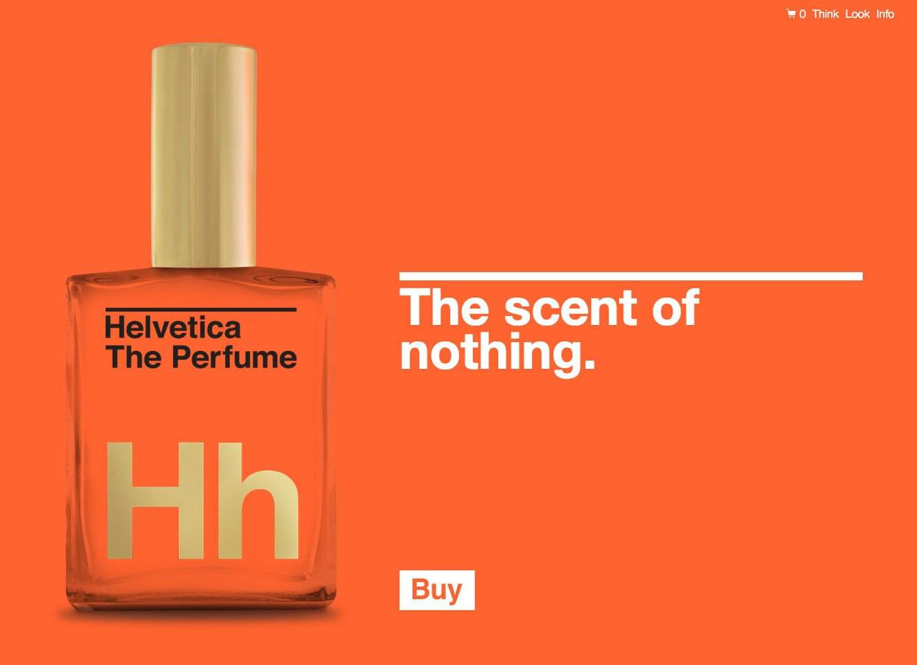
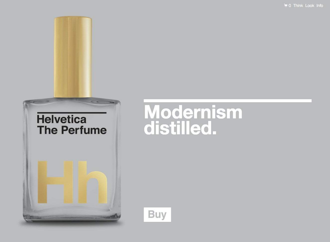
Helvetica The Perfume

You know? This is just class! I can easily see people stumping up the $62 to buy a bottle of, Helvetica The Perfume: The Scent of Nothing

Good packaging sells, and it can sell anything if you do it right, and I’m pretty sure the folks responsible (GutsandGloryand.us) for this have got this pretty damn right. Great website, good design, nice colours, and great great packaging. Did I mention great packaging? heck, it even has 24k gold printing as well as some letter-pressing happening.

I mean f**k, I’d even be tempted to buy a bottle just to put on my desk and stare at, even maybe fondle and caress.

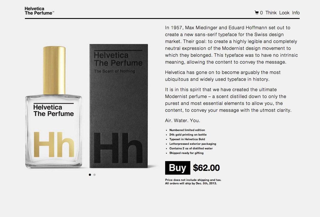
This is what you get for your $62:

  • Numbered limited edition
  • 24k gold printing on bottle
  • Typeset in Helvetica Bold
  • Letterpressed exterior packaging
  • Contains 2 oz of distilled water
  • Shipped ready for gifting

You can follow the dedicated Twitter account right here: @HelveticaParfume and head over to the shopping page (it is legit) if you are dead eager to get your own bottle.

Hat-tip to Julie Bakopoulou for the heads-up.

Helvetica The Perfume

From the website: In 1957, Max Miedinger and Eduard Hoffmann set out to create a new sans-serif typeface for the Swiss design market. Their goal: to create a highly legible and completely neutral expression of the Modernist design movement to which they belonged. This typeface was to have no intrinsic meaning, allowing the content to convey the message.

Helvetica has gone on to become arguably the most ubiquitous and widely used typeface in history.

It is in this spirit that we have created the ultimate Modernist perfume – a scent distilled down to only the purest and most essential elements to allow you, the content, to convey your message with the utmost clarity.

Air. Water. You.

Helvetica The Perfume Helvetica The Perfume Helvetica The Perfume

Read Helvetica The Perfume: The Scent of Nothing on The Logo Smith - forging logomarks of distinction since '86.

Wilfully Plagiarising? LogoThief Is On Your Case

$
0
0

Logothief

LogoThief is a great idea by ‘persons unknown’. If you are the sort of person that doesn’t give a hoot about stealing other designers’ logo creations, then be warned, as you might end up being featured on LogoThief.com

Poor Jeff Fisher routinely finds himself the target of plagiarists, and having to expend so much emotional and practical energy simply trying to stop these delinquents to reclaim what is rightfully theirs. No surprise then that he is featured on LogoThief, with his well known logo for, Cat Adoption Team, being the most recent of his to be exploited: Catnapped!

LogoThief-Catnapped


There are some other well known logos with similar stories to Jeff, and most are just incredibly brazen with it. There are usually two kinds of scenarios: one is where you can’t reason, or even establish contact with the plagiarist; the other is where there is a more innocent reason, and the moment you establish contact are able to sort ‘something’ out.


I’m all up for naming and shaming those that have malicious tendencies, but my one slight concern is that an innocent case of ‘two logos looking similar’ will be exposed, and featured on LogoThief, for wilful copying thus putting the designers in a slightly awful predicament. Seen plenty of instances where similar logo designs have cropped up at relatively the same time: with one designer being blamed for plagiarism when was it was just coincidence, and this does happen. So hopefully they will not shoot first…

Read Wilfully Plagiarising? LogoThief Is On Your Case on The Logo Smith - forging logomarks of distinction since '86.

James Bond Fan Art Posters by Alain Bossuyt

$
0
0

From russia with love James Bond Poster.jpg


With so many self-initiated design projects doing the circuits, it’s a real joy to come across some that are truly inspiring, and not just another ‘minimal’ take on something.

Alain Bossuyt

Alain Bossuyt has really done himself proud with these colourful James Bond Fan Art Posters. You can view them over on his Behance profile, and give him an ‘appreciation’ as well whilst you are there.

There is also another project page on Alain’s Behance profile with yet more James Bond Fan Art posters!

Nice find by Gruber over on DaringFireball

Diamonds are forever James Bond Poster Live and let die James Bond Poster.jpg A View to a kill James Bond Poster Dr No_3 Dr No James Bond Poster.jpg Gold Finger  James Bond Poster.jpg You only live twice James Bond Poster.jpg

Read James Bond Fan Art Posters by Alain Bossuyt on The Logo Smith - forging logomarks of distinction since '86.


Designers Touching Their Faces: Now With Me

$
0
0

Graham Logo Smith

I so had to get in on this fun. I love touching my own face, rarely a moment goes by when I’m not touching it in one place or another. Now I have a valid reason to share on my face touching photographs with you.

I get that this post, ideally, ought to be about the actual website: Designers Touching Their Faces, but I think a few more of me touching my first is more important.

You are just so very welcome.

Graham Logo Smith-3
Graham Logo Smith
Graham Logo Smith-14

Designers Touching Their Faces

Designers Touching their faces

“If you’re a designer, you ain’t shit if you don’t touch your face in photographs.”

Once you have admired my photograph, then I suppose you could also take a look at the Designers Touching Their Faces Tumblr, by Nick Foster over on hellofosta.com

I just love these Tumblr projects that pop up, and this one is close to my heart. Can’t quite tell if it’s a piss-take, or a serious homage to the art of face-touching…

Well done to Nick Foster for showing us the admirable company we are in.

I find myself, for the first time, wondering if I should be worried by these imitators. Touching ones face is a true art, it can’t be taught, it’s gift that keeps on giving…

This was found on Swiss Miss

Oh, and as luck would have it, there is another one of me: checking to see if I’m still alive…

Graham Logo Smith-15 copy

Read Designers Touching Their Faces: Now With Me on The Logo Smith - forging logomarks of distinction since '86.

“The Bent Bullet” X-Men: Days of Future Past – Full Length Soundtrack

$
0
0

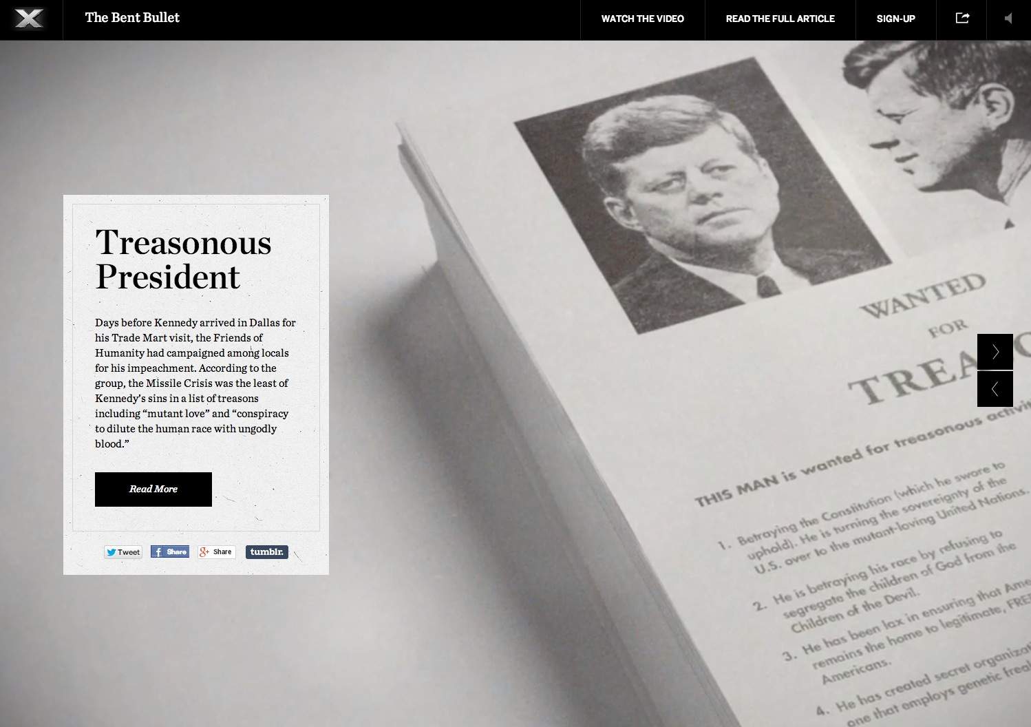
JFK AND THE MUTANT CONSPIRACY — Half a century ago, Magneto was implicated in the mutant plot to assassinate President John F. Kennedy. The events of that fateful day in November have been a point of contention between humans and the mutants ever since.

This has totally made my week: finding the full-length soundtrack to the amazing viral website, “The Bent Bullet—X Men:Days of Future Past.

I can’t honestly tell you how many times I have had the website version of this musical score playing whilst working. It’s so hauntingly beautiful, and I’ve not even come close to getting tired of it.

Then Luke Turner, just a few moments ago, tweeted me a link to the YouTube video with the full length score on it.

An absolute delight!

Still unsure to it’s origins, name etc, so I do hope someone soon can provide a name so credit can be given. It’s well deserved!


Thanks again to Luke Turner

The Bent Bullet

While knowledge of mutants was not yet public, rumors of individuals with strange abilities started surfacing from the summer of 1963. Nearly a dozen mutants were secretly murdered by the CIA and the public was suspicious of government involvement. American Citizens awaited a response from their President.

The Bent Bullet

Days before Kennedy arrived in Dallas for his Trade Mart visit, the Friends of Humanity had campaigned among locals for his impeachment. According to the group, the Missile Crisis was the least of Kennedy’s sins in a list of treasons including “mutant love” and “conspiracy to dilute the human race with ungodly blood.”


Read “The Bent Bullet” X-Men: Days of Future Past – Full Length Soundtrack on The Logo Smith - forging logomarks of distinction since '86.

Gratisography – Free Hi-Resolution Photographs by Bells Design

$
0
0

Gratisography-by-Bells-Design

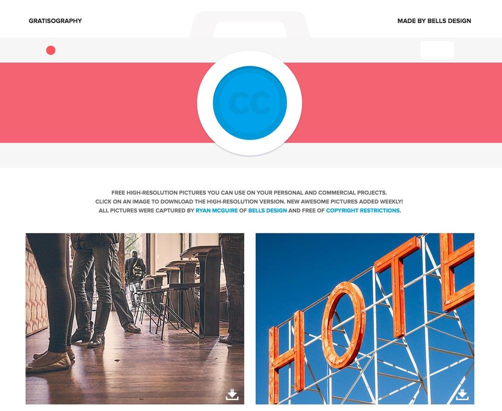
Gratisography: Free high-resolution pictures you can use on your personal and commercial projects.
Click on an image to download the high-resolution version. New awesome pictures added weekly!

All pictures were captured by Ryan McGuire of Bells Design and free of copyright restrictions.

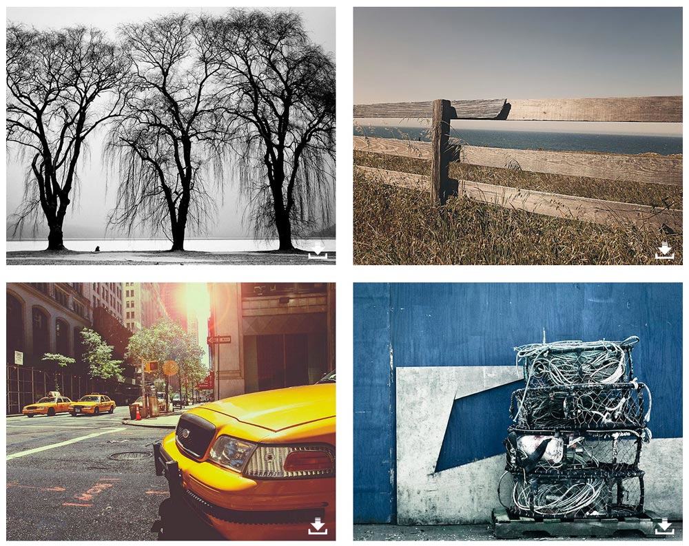
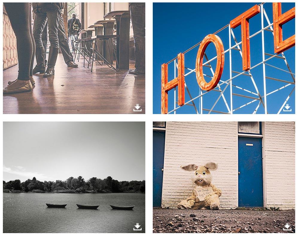
Much in a similar vein to the previously blogged, UnSplashGratisography is a website offering free downloadable photography for you to use freely.

I don’t think this type of endeavour should ever be underestimated, or undervalued. Taking excellent quality photographs. and making them available without ANY restrictions, is pretty admirable in my book!

I have been using quite a few photographs off UnSplash myself of late, and aspects of my own work have been much improved because of this.

 Good for Ryan McGuire I say, and long may you take lovely photographs for all of us to use and enjoy!

A few Gratisography examples

Gratisography-by-Bells-Design-2 Gratisography-by-Bells-Design-2

Read Gratisography – Free Hi-Resolution Photographs by Bells Design on The Logo Smith - forging logomarks of distinction since '86.

Real World: 1968 Mexico Olympics Logo and Brand Identity (Lance Wyman)

$
0
0

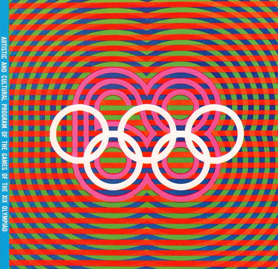
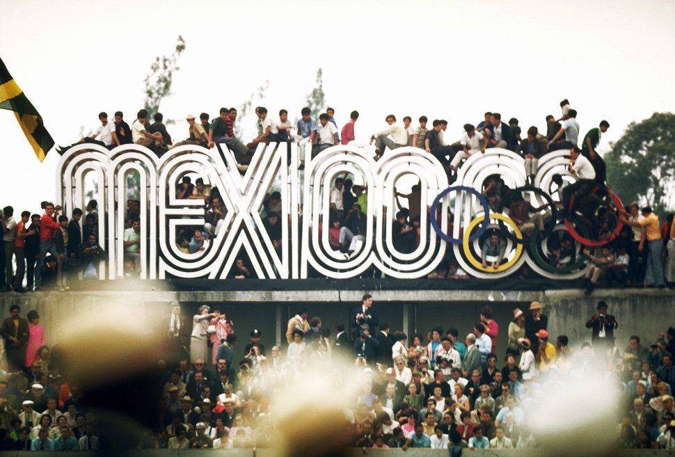
mexico-68-olympics-02

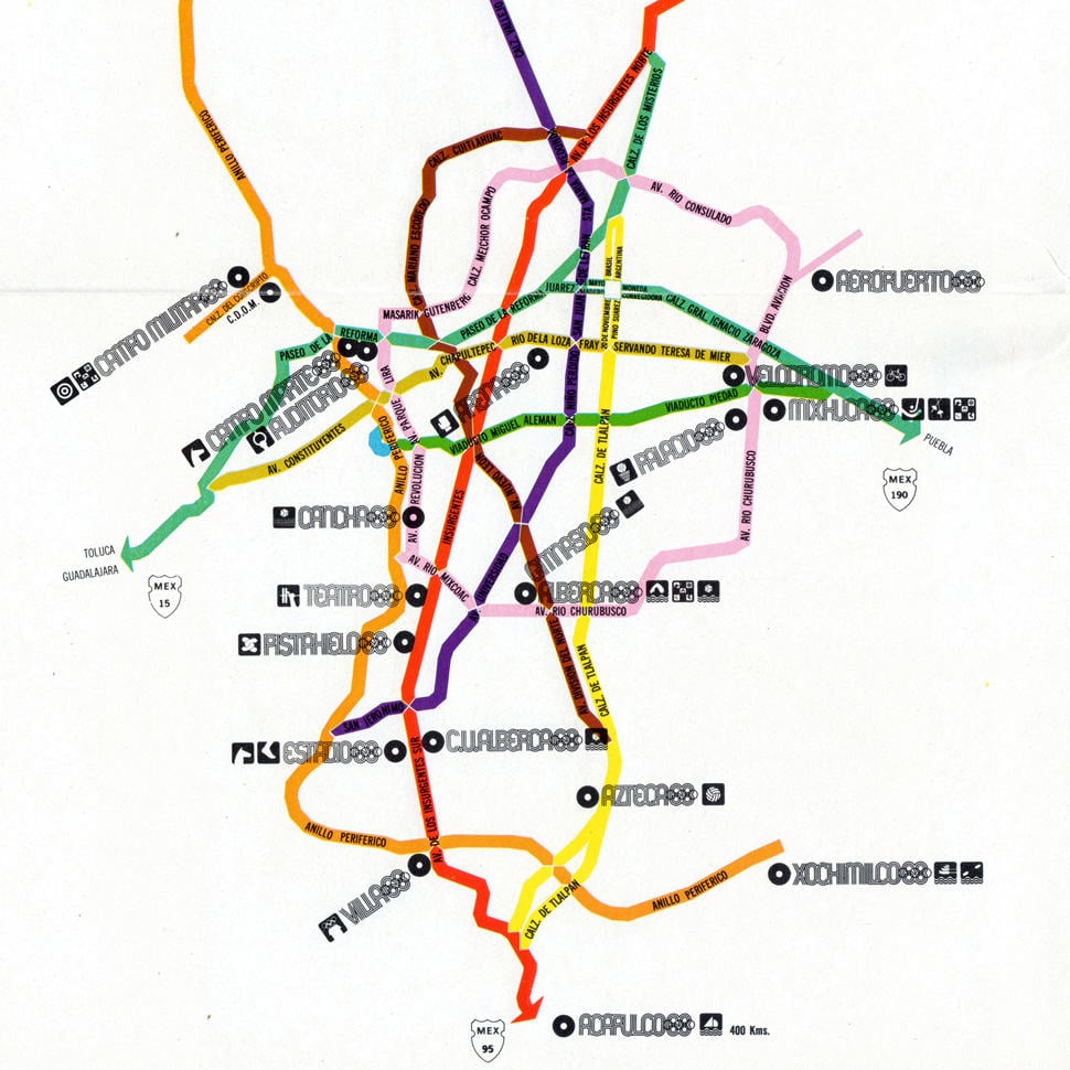
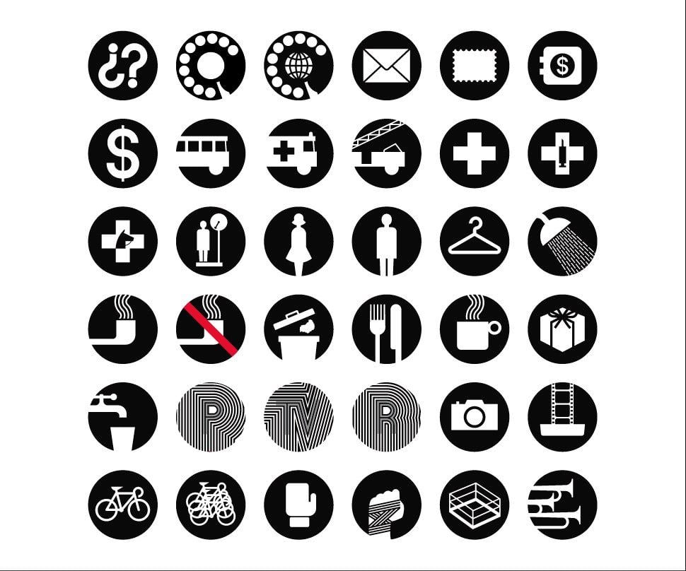
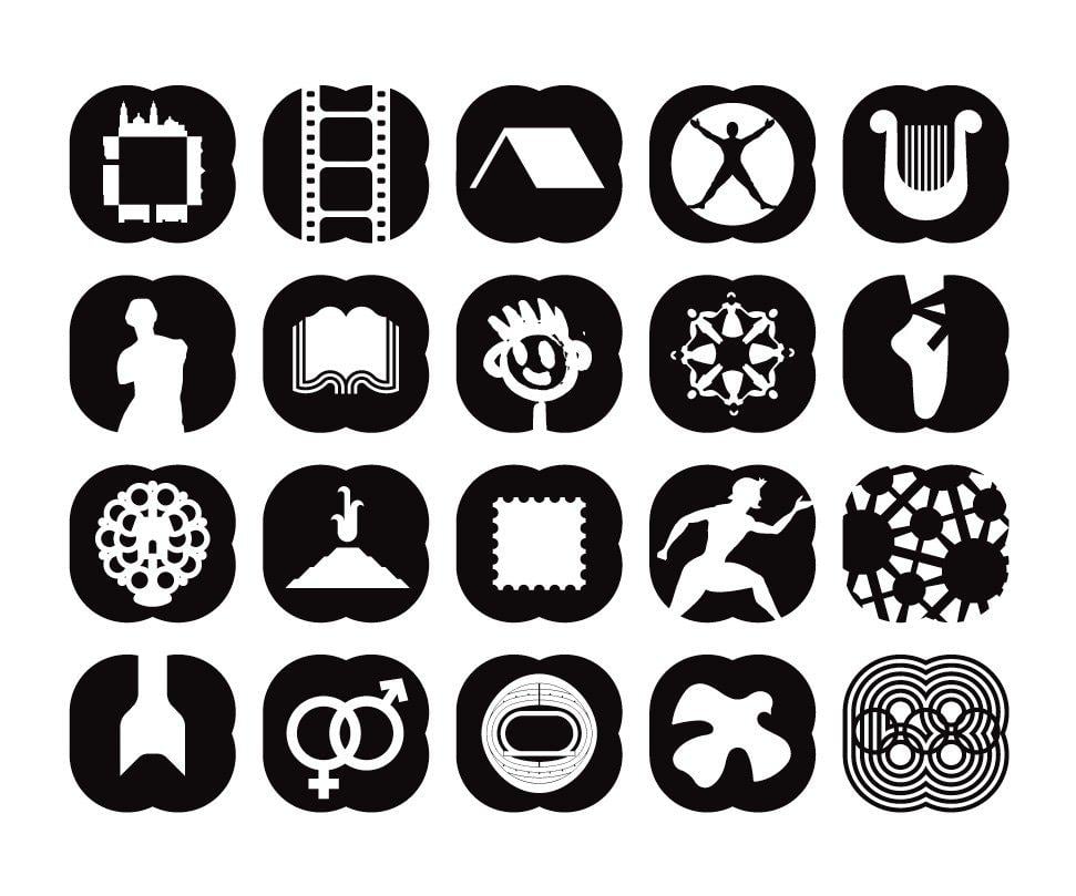
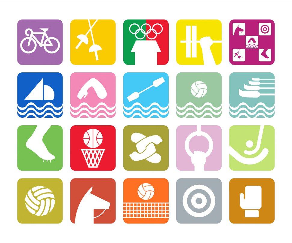
If you are looking for a pretty complete run-through of the 1968 Mexico Olympics logo and graphic system (brand identity), then this is a pretty decent place to start.

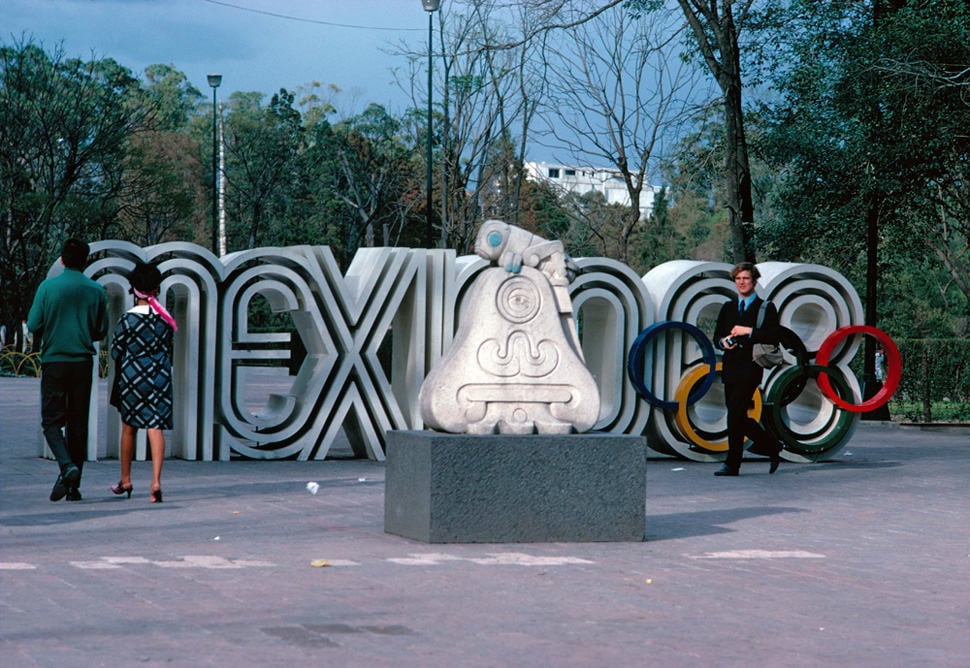
Found a huge article over on Graphic Ambient that contains image-after-image of the Olympic logo and graphic system in real-world scenarios, as well as more deconstructed style logo images.

Lance Wyman was the main creative genius behind the 1968 Mexico Olympics Logotype as well as setting the tone for the rest of the Olympic identity:

Traditional-Mexicon-Culture

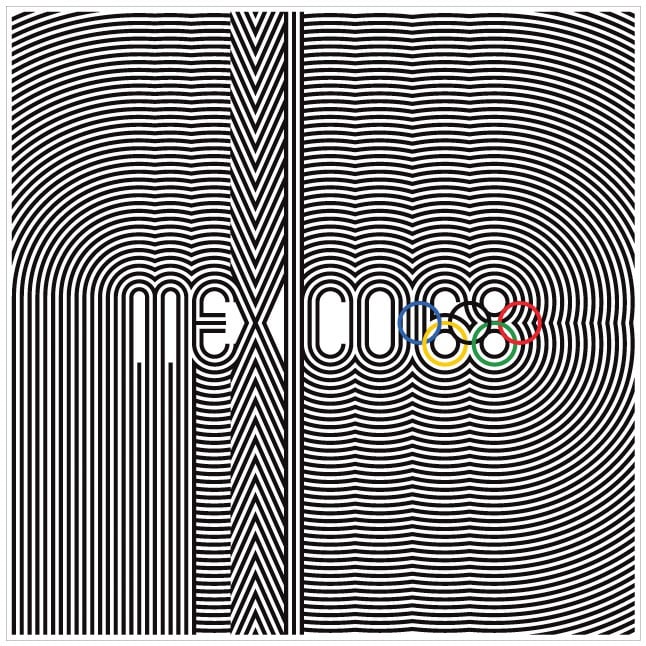
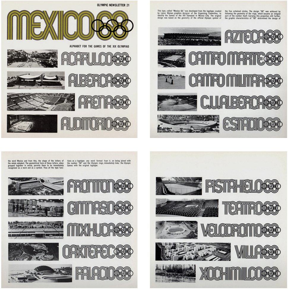
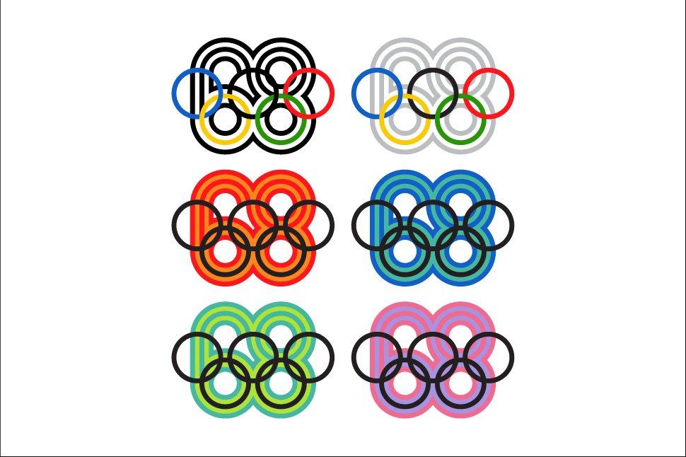
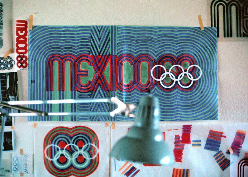
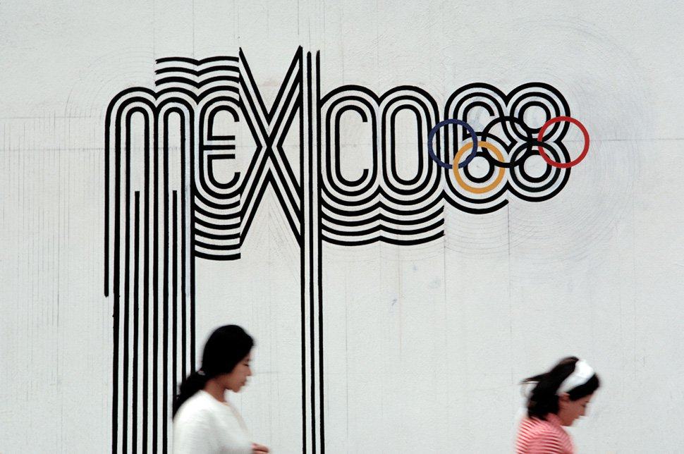
The Mexico 1968 logotype, based on traditional forms from Mexican culture (above) as well as being 60′s Op-art kinetic typography, set the tone for the entire graphics system.

mexico-68-olympics-logo

1968 Mexico Olympics, Mexico by Mexico 68 Design Team

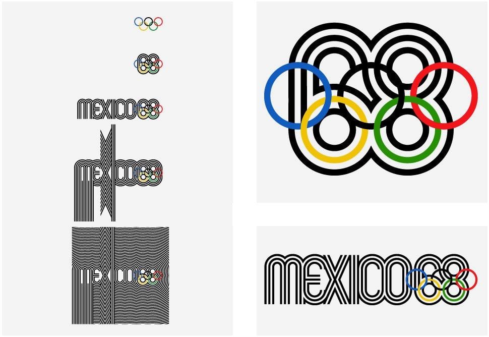
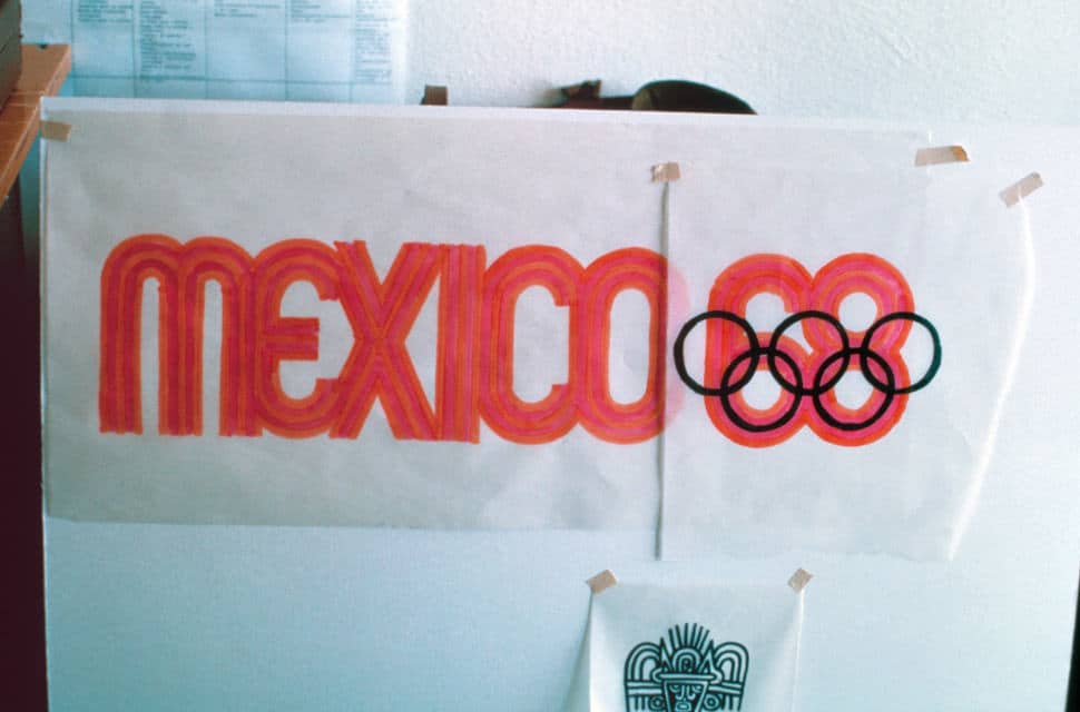
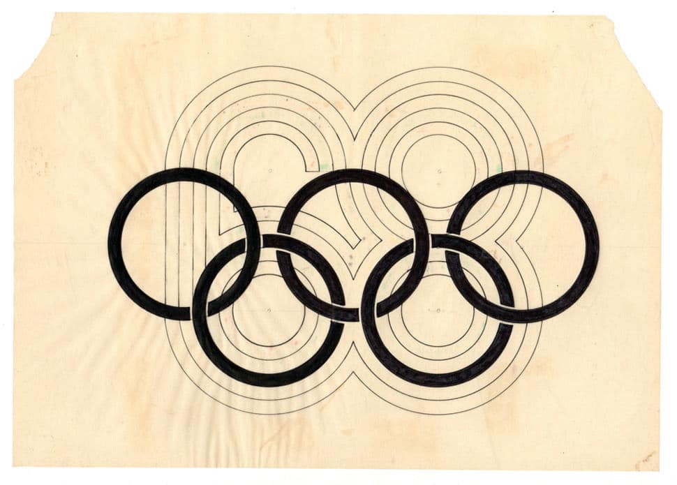
From Graphic Ambient: The starting point was the mandatory five-ring logo that identifies the modern Olympic Games. It was the realisation that the geometry of the five rings could be expanded to generate the number ’68′, the year of the games and with the addition of the word ‘Mexico’ the logotype was created.

Mexico 68 clearly identifies the country, the year and the event. The distinct geometric forms suggest early Mexican cultures and Mexican folk-art, and the final design references 1960′s Op Art.

Program Director
Pedro Ramirez Vázquez
(Chairman of the Organizing Committee)

Design Team Directors
Urban Design: Eduardo Terrazas
Olympic Publications: Beatrice Trueblood
Student Design Team: Manuel Villazon
Special Projects: Peter Murdoch
Graphic Design: Lance Wyman

Graphic Design Team
Lance Wyman, Beatrice Colle,
Jose Luis Ortiz, Jan Stornfeld

Lance_wyman_portrait

Lance Wyman“In 1966 I went to Mexico City with Peter Murdoch to participate in a competition to design the graphics for the 1968 Mexico Olympic Games. It was the beginning of an adventure that has continued to influence my work and my life.

The Mexico68 logotype that I designed was instrumental in winning the competition. The resulting design program, a multidimensional integration of logos, typography and color, developed to communicate to a multilingual audience, was cited by Philip Meggs in the book “A History of Graphic Design” as “…one of the most successful in the evolution of visual identification…” The lessons from this program have been a constant guide to my work.”

Resources


mexico-68-olympics-07

mexico-68-olympics-21

mexico-68-olympics-15

mexico-68-olympics-14

mexico-68-olympics-12

mexico-68-olympics-11

mexico-68-olympics-10

mexico-68-olympics-09

mexico-68-olympics-08

mexico-68-olympics-06

mexico-68-olympics-05

mexico-68-olympics-04

mexico-68-olympics-03

mexico-68-olympics-01


Read Real World: 1968 Mexico Olympics Logo and Brand Identity (Lance Wyman) on The Logo Smith - forging logomarks of distinction since '86.

13″ Macbook Air Recycled Cement Bag Laptop Messenger Bag by The Wren

$
0
0

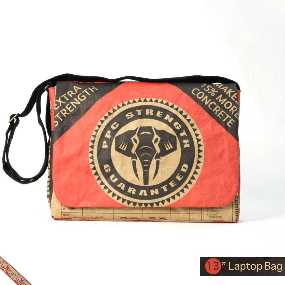
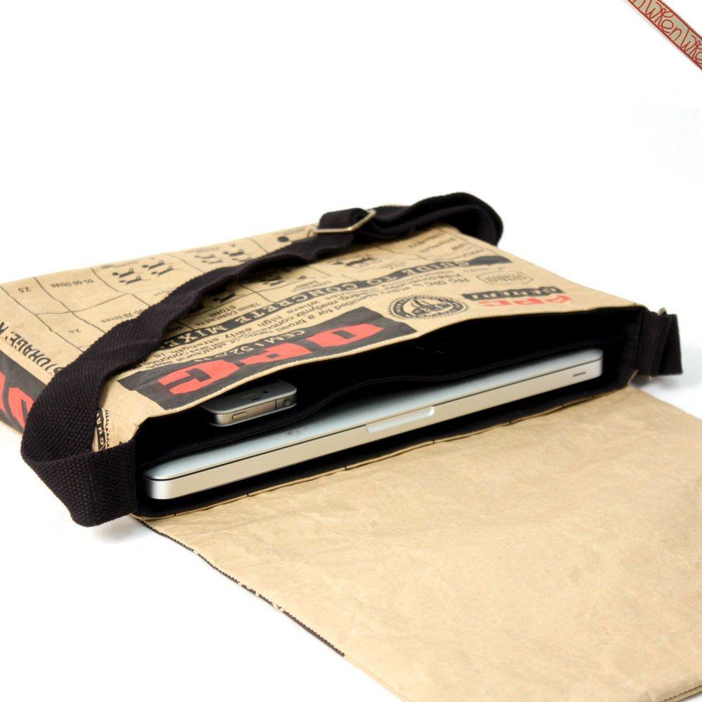
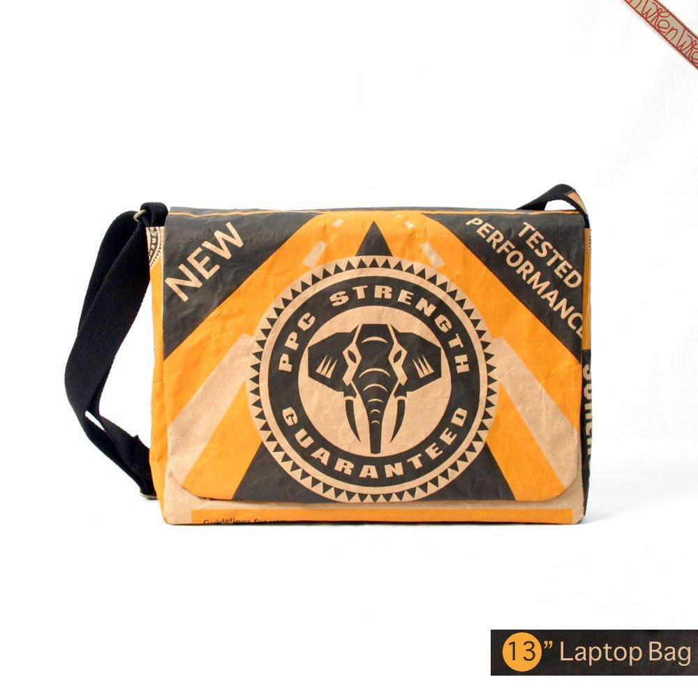
13 Macbook Air Cement Laptop Messenger Bag - Red


I’ve been searching for a suitable messenger style laptop bag for my new 13″ Macbook Air, and my search has taken me all over the place. There are some lovely bags around, from: leather, canvas, nylon and even various recycled materials. Here are a few I’ve favourited on Etsy: http://etsy.me/1aFQzaJ

One the most well known companies using recycled materials, I guess, would be freitag.ch, there is also elvisandkresse.com, who makes fashion items from recycled fire hoses, which is pretty cool.

Although I’ve checked 100′s of laptop messenger bags, there have been only a handful that I really feel suit my style, and would be happy enough to hold my Macbook Air.

13 Macbook Air Cement Laptop Messenger Bag - Blue

Etsy

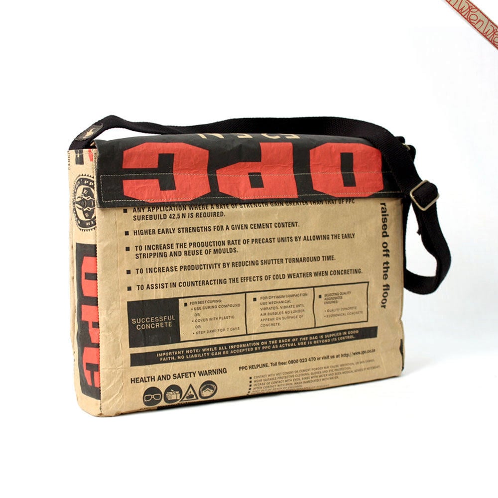
Etsy is a great place to find all sorts of treasures, and I have ended up buying numerous camera cases, phone cases and other things over the last few years. Etsy again came up trumps for a suitable bag in the form of this fantastic recycled / repurposed Cement bag made by The Wren. It’s almost as though the design of these cement bags was done with the messenger bags in mind, as they just seem to look so perfect.

If you visit the The Wren’s website you’ll see a whole range of: bags, sleeves, cases all made from the same Pretoria Portland Cement paper bags.

I’m ordering the 13″ Black with red highlights, can’t wait! There’s so much to love about these cement bag bags: the bold and striking graphics, the typography, the icons and symbols, the colour use, the snug padded fit for your much cherished laptop, the simple fact these are bloody cement bags!

I’ll give a review once I have received and used my own, and will likely offer up a few of these in an upcoming giveaway. So make sure you are receiving my blog newsletter so you don’t miss out!

13 Macbook Air Cement Laptop Messenger Bag


Recycled Cement Bag Summary

You really need to check out the product page to get the full story on how these are made, and how awesome they are. In the 13″ size you can get: black, red, yellow and blue, but the other 15″ and 17″ laptop sizes are also available.

So here’s a quick summary:

  • Each one is made to order
  • Made from unused Pretoria Portland Cement paper bags
  • Materials: paper, fusable cotton, cotton webbing, metal adjusters, hidden magnets, cotton, foam, batting, scotch guard, embroidered label
  • 2 sections, 2 pockets: carry laptop accessories alongside your laptop
  • Fully padded with padded divider
  • Closes with 2 magnets
  • Bag is treated with Scotch Guard so fully weather proof
  • Cotton webbing, and fully adjustable strap
  • Size for 13″ laptop: 34cm (length) X 25,5 (height) X 6cm (width)

Very cool indeed.


13 Macbook Air Cement Laptop Messenger Bag - Yellow

13 Macbook Air Cement Laptop Messenger Bags

13 Macbook Air Cement Laptop Messenger Bag

13 Macbook Air Cement Laptop Messenger Bag - Black

Read 13″ Macbook Air Recycled Cement Bag Laptop Messenger Bag by The Wren on The Logo Smith - forging logomarks of distinction since '86.

The Santa Brand Book AD 2013 Edition – Santa’s Brand Refreshed for 2013

$
0
0

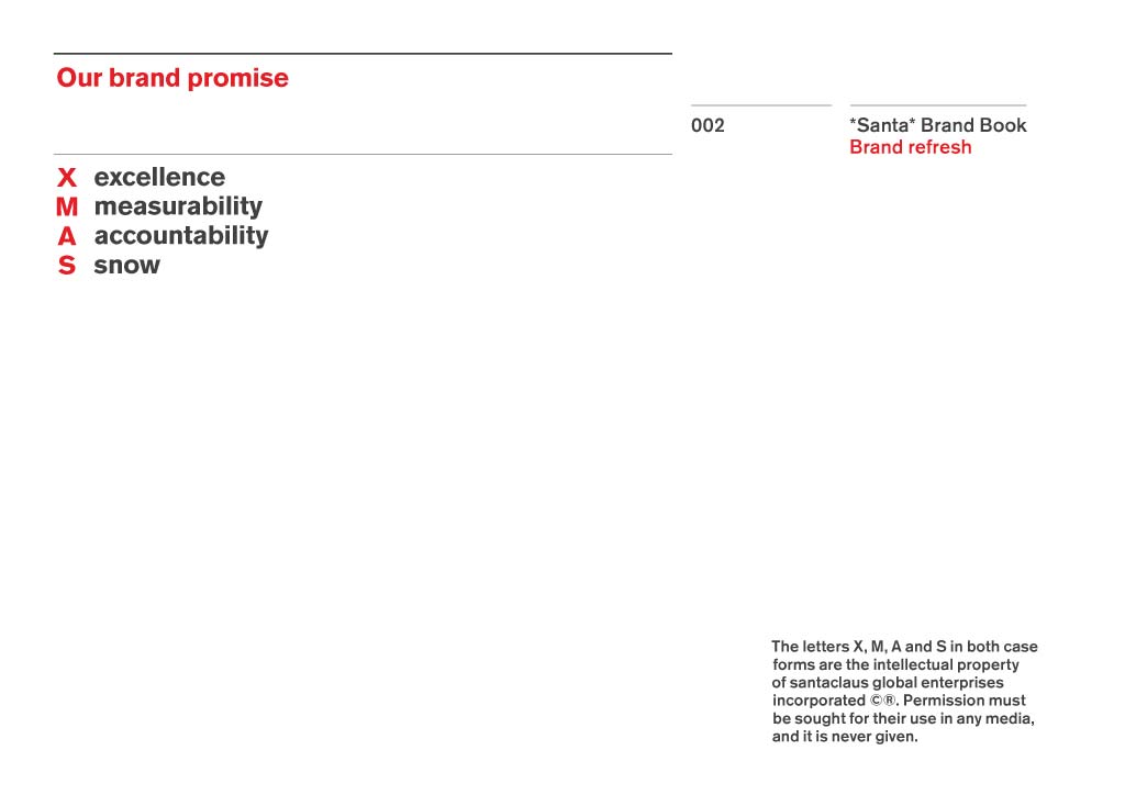
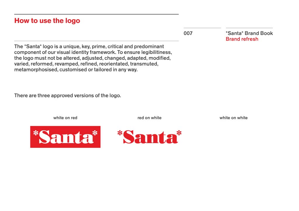
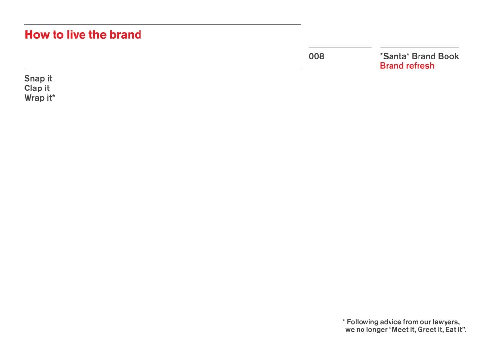
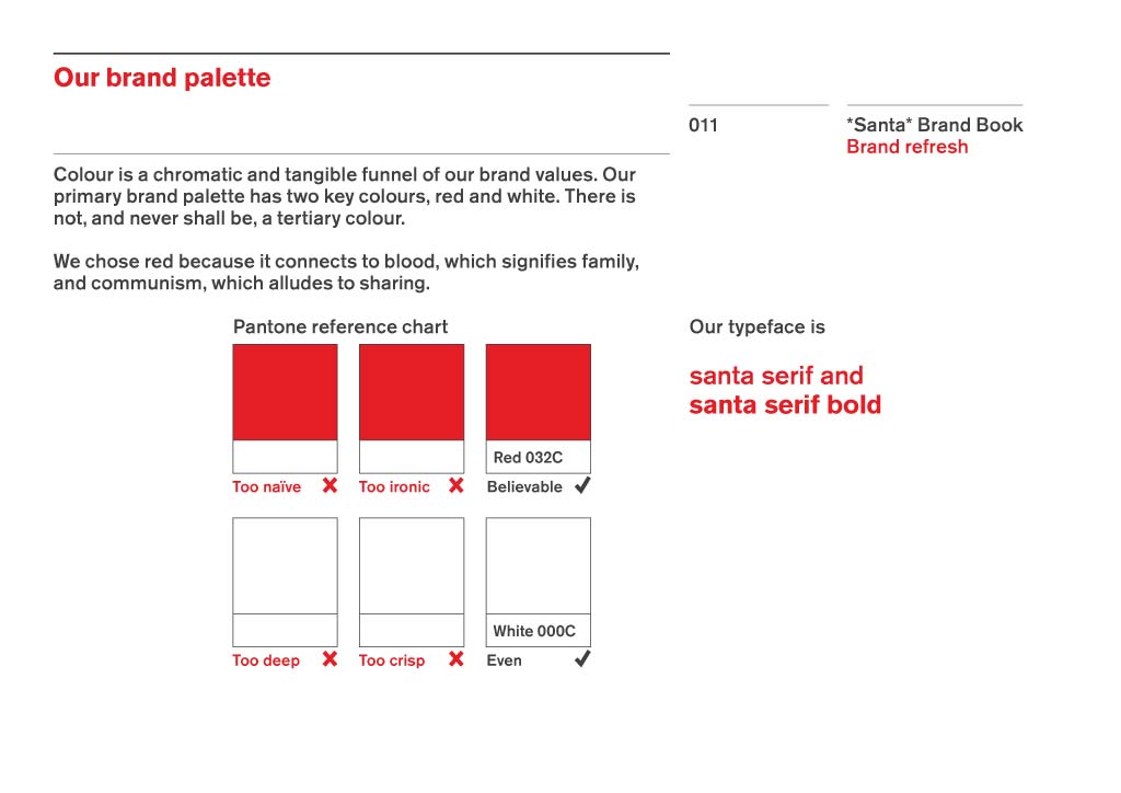
Santa-Brand-Book-Guidelines-2013-Version

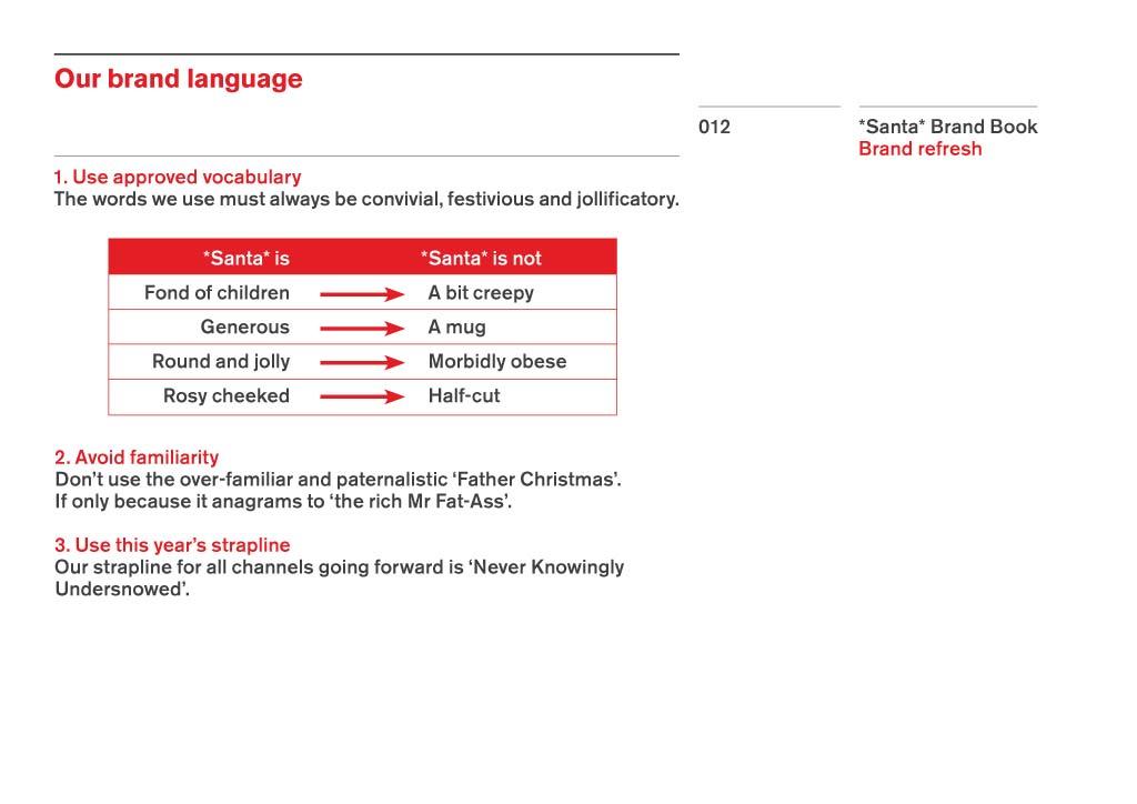
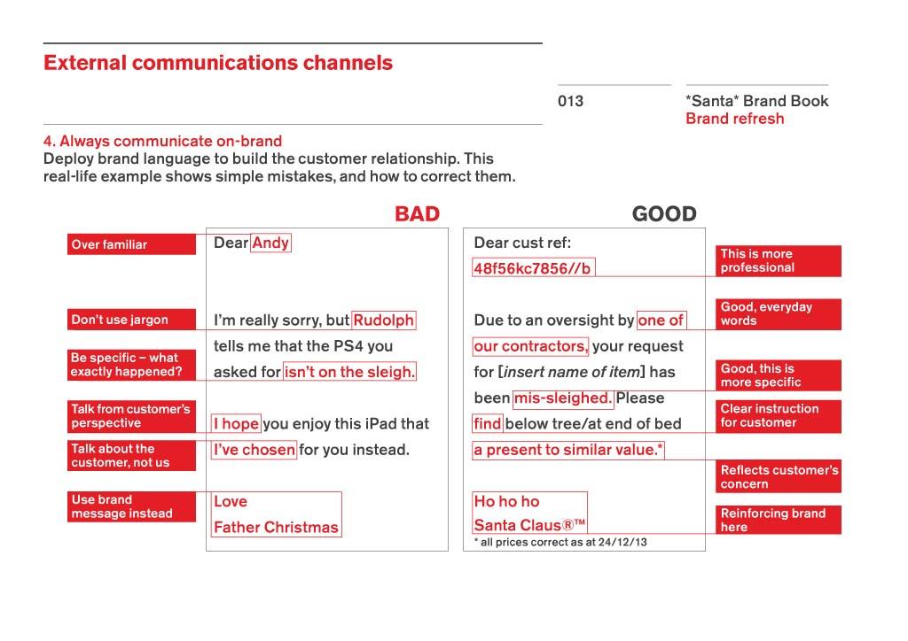
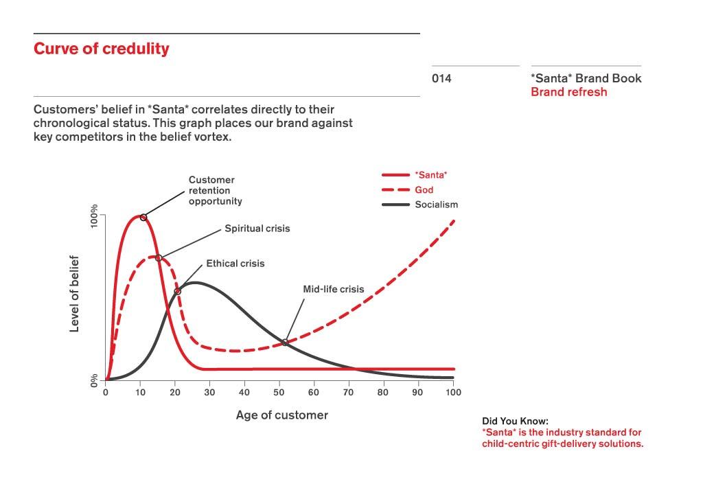
Excellent. Just excellent. Simon Grover over at Quietroom sent me a note earlier. In that note was a message telling me they have been busy foraging around gathering updates for The Santa Brand Book, something they previously won accolades and hugs for given it’s importance to us all.


*Santa* is a Concept, not an idea. It’s an Emotion, not a felling. It’s both Yesterday and Today. And it’s Tomorrow as well.

Santa-Brand-Book-Guidelines-2013-Version


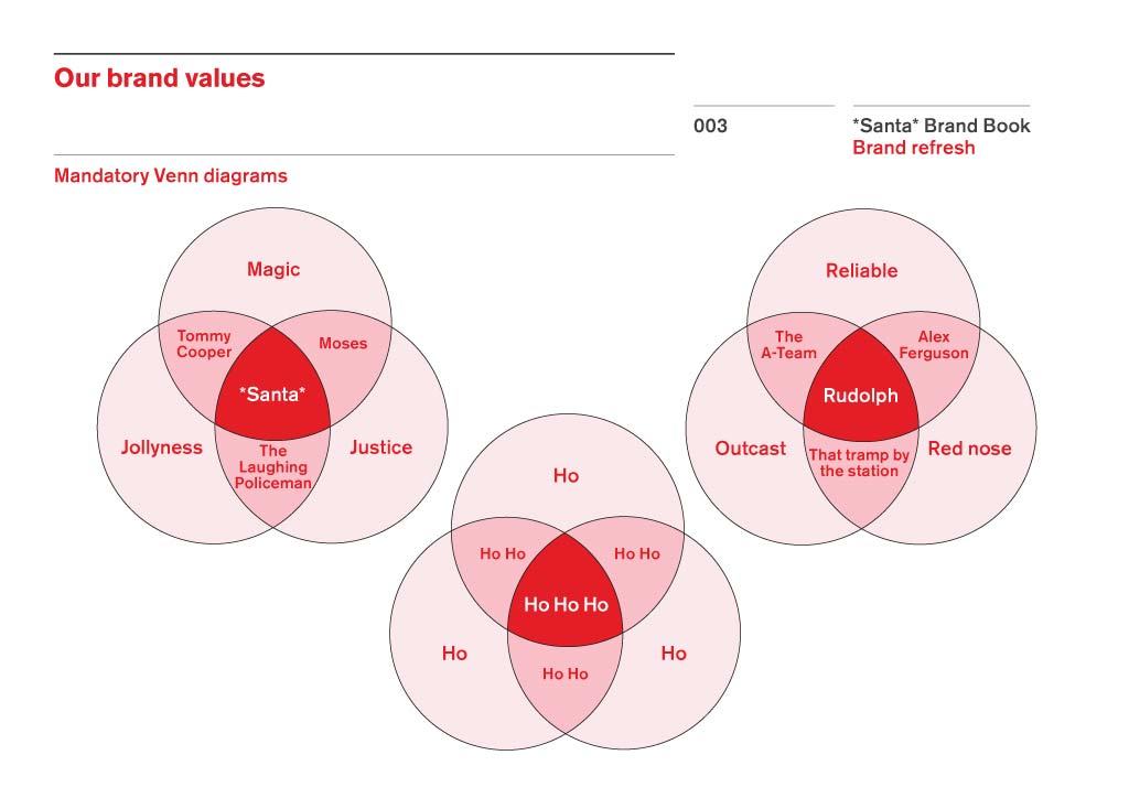
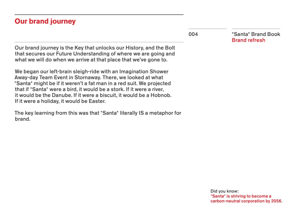
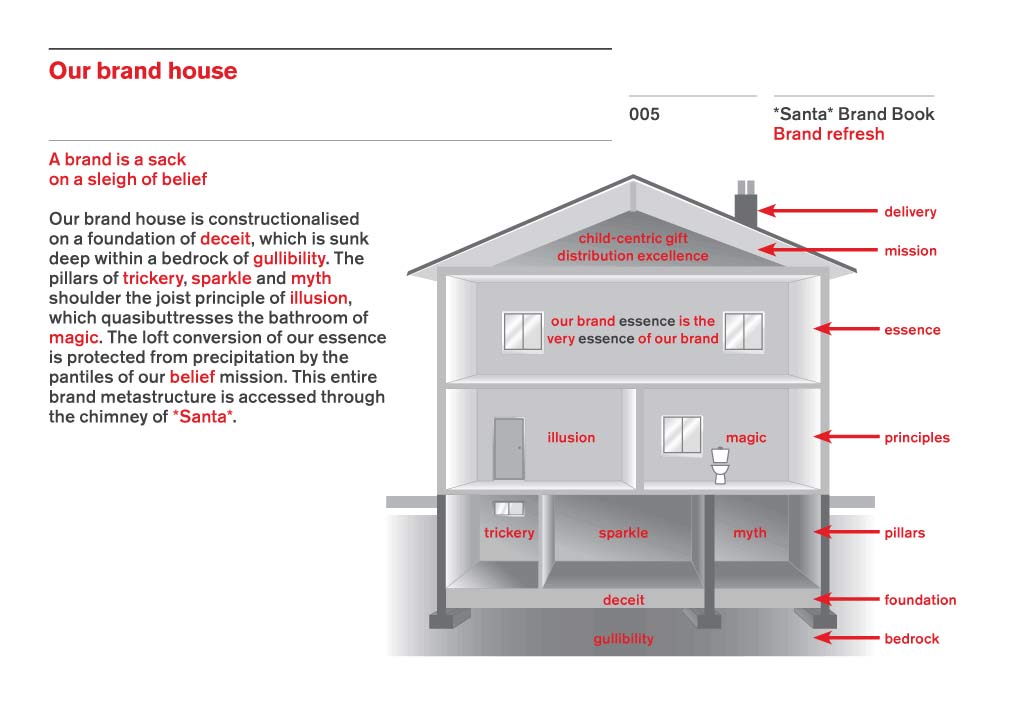
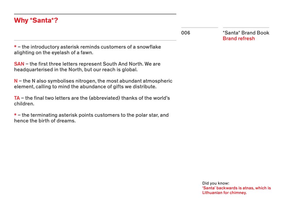
We now have, thanks to Quietroom, a new and updated version of the Santa Brand for AD 2013 with 15 pages of: Santa trivia, identity guidelines, stats, graphs and venn diagrams. It’s a compelling read, and I now have a much broader appreciation of the structure and personality of Santa’s brand. This can only be a good thing as we roll ever closer to Christmas 2013.

Go and check The Santa Brand Book: The AD 2013 edition, over at: http://www.quietroom.co.uk/santa_brandbook

*Santa* winds infinite Possibilities around finite Limitations to evoke the essence of invention and the Odour of Nostalgia. It has the complexity of Simpleness and the Simplicity of complexitiveness.”

Santa-Brand-Book-Guidelines-2013-Version

Santa-Brand-Book-Guidelines-2013-Version

Santa-Brand-Book-Guidelines-2013-Version

Santa-Brand-Book-Guidelines-2013-Version

Santa-Brand-Book-Guidelines-2013-Version

Santa-Brand-Book-Guidelines-2013-Version

Santa-Brand-Book-Guidelines-2013-Version

Santa-Brand-Book-Guidelines-2013-Version-Page10

Santa-Brand-Book-Guidelines-2013-Version

Santa-Brand-Book-Guidelines-2013-Version-Page12

Santa-Brand-Book-Guidelines-2013-Version

Santa-Brand-Book-Guidelines-2013-Version

Santa-Brand-Book-Guidelines-2013-Version

Read The Santa Brand Book AD 2013 Edition – Santa’s Brand Refreshed for 2013 on The Logo Smith - forging logomarks of distinction since '86.

Win a Kickstarter Funded ‘Slate Mobile AirDesk’ by Nathan Mummert

$
0
0

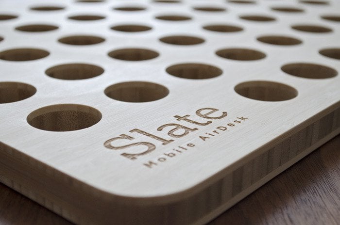
Slate Mobile AirDesk by Nathan Mummert


It’s been an age since my last giveaway so it’s nice to be able to arrange another one with such a useful prize. Introducing the Slate Mobile AirDesk by Nathan Mummert: a Kickstarter project which I have backed. I believe Nathan reached the desired $6500 goal in just a few days and has now received over £88,338 in pledges!

I have pledged enough for two Slate Mobile AirDesk‘s: one for me and one for this giveaway. They should be shipping to the UK sometimes mid-late January, but I will announce the winner sometime Christmas day, so a nice extra Christmas present for someone!

Also, don’t miss out on a change to win one-of-three Helvetica Moleskine’s

How to Participate

  1. Leave your name in comments below.
  2. Any Google+ and/or Facebook Likes (found in my footer) would be appreciated, but not compulsory.
  3. As all my giveaways are completely self-funded, if you are able to visit one or more of my site sponsors (found top of my sidebar) this would be much appreciated: helps fund the giveaway, and others’ to come.
  4. That’s it. Once I know who the winner is I will be in touch to arrange appropriate postage and packing.


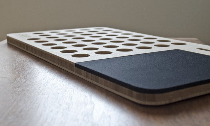
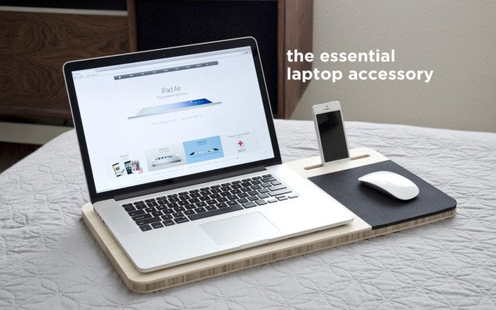
The essential accessory for your laptop. Created for business professionals, students, designers, gamers, or just anyone with a laptop.

Slate Mobile AirDesk by Nathan Mummert

Introducing the Slate

Laptops are designed for mobility but they’re missing the comforts of a desk. We experience poor posture and back pains, lost items, heat on our laps, and an overall slow work speed. We searched through one retail store after another, but much to our dismay, we only found basic accessories and plain-old surfaces for our laptops. So, the invention of the Slate was born. It’s the only product of it’s kind and with your help – we can make it affordable for everyone to enjoy.

Slate Mobile AirDesk by Nathan Mummert

Slate Mobile AirDesk by Nathan Mummert

Slate Mobile AirDesk by Nathan Mummert

Slate Mobile AirDesk by Nathan Mummert

Slate Mobile AirDesk by Nathan Mummert

Slate Mobile AirDesk by Nathan Mummert

Slate Mobile AirDesk by Nathan Mummert

Slate Mobile AirDesk by Nathan Mummerted

Read Win a Kickstarter Funded ‘Slate Mobile AirDesk’ by Nathan Mummert on The Logo Smith - forging logomarks of distinction since '86.


Gorgeous Vintage Era Type & Logo Designs by Ben Didier

$
0
0

Vintage Designs by Ben Didier

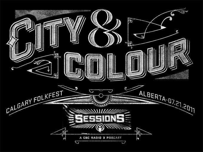
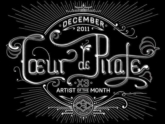
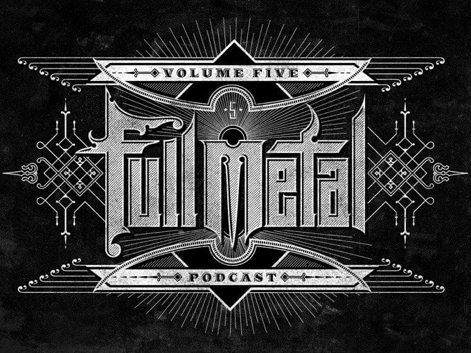
About Ben: “My name is Ben Didier. I am a graphic designer, type addict and music nerd who can usually be found cooking tacos or riding my bike around Vancouver, Canada. I am currently the Senior Designer at CBC Music.”

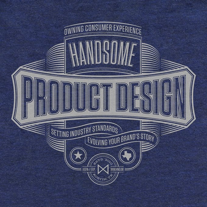
When I first came across Ben’s website: Pretty/Ugly Design, via a post for some promotional t-shirt designs for Handsome, I first thought I’d simply post about those as they were so very cool.

Problem was that once I stared browsing the rest of Ben’s portfolio I simply couldn’t just post about one project because so many of them are outstandingly and fantastically awesome

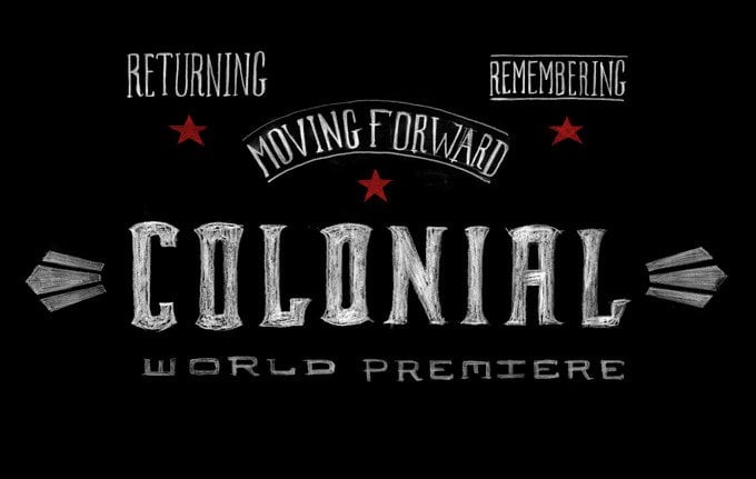
So here (below) are a few select designs, all mostly come with a hand crafted typographic lettering vintage flair.

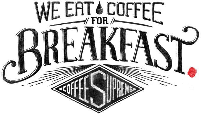
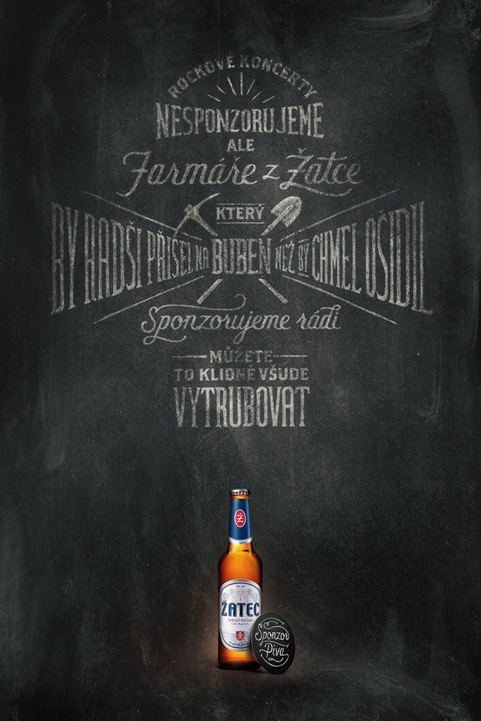
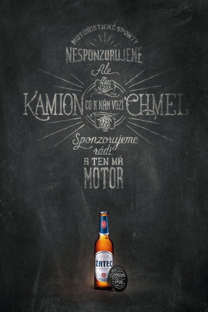
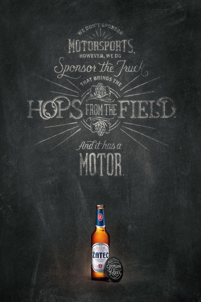
I think some of my real favourites are the Zatec Beer Ads, all last 6 of them below.

breakfast_680

stayinside_680

Vintage Designs by Ben Didier

Vintage Designs by Ben Didier

Vintage Designs by Ben Didier

Vintage Designs by Ben Didier

Vintage Designs by Ben Didier

Vintage Designs by Ben Didier

colonial1_680

zatec6_680

zatec5_680

zatec4_680

zatec3_680

zatec2_680

zatec1_680

Read Gorgeous Vintage Era Type & Logo Designs by Ben Didier on The Logo Smith - forging logomarks of distinction since '86.

It’s Here! The Helvetica Moleskine Christmas Giveaway

$
0
0

Helvetica-Moleskine-Notebook-5

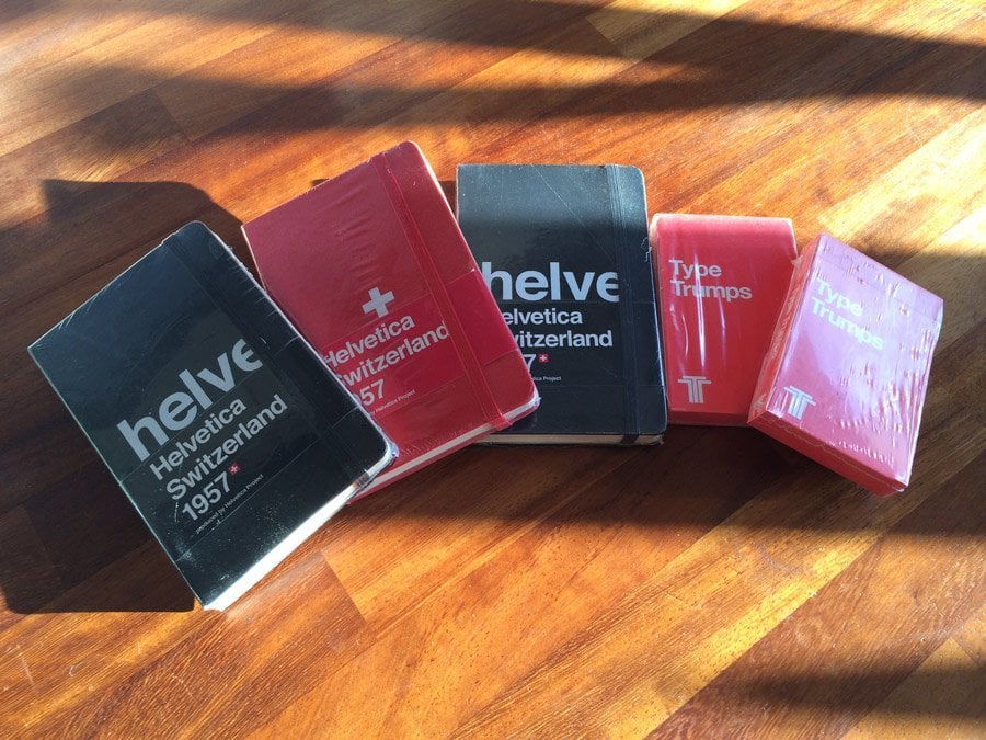
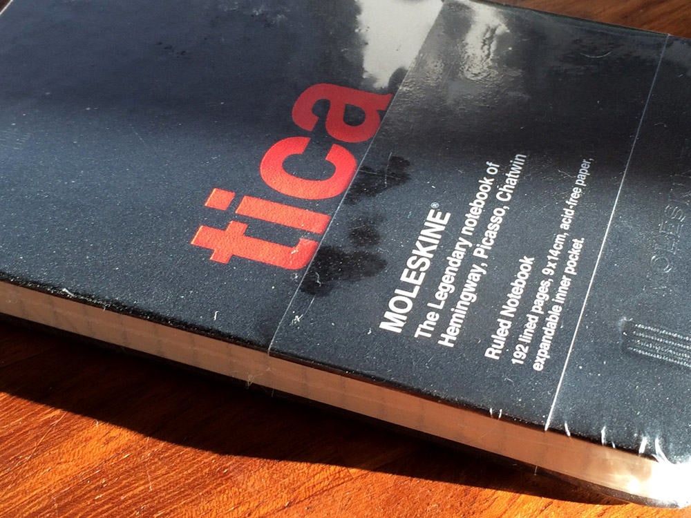
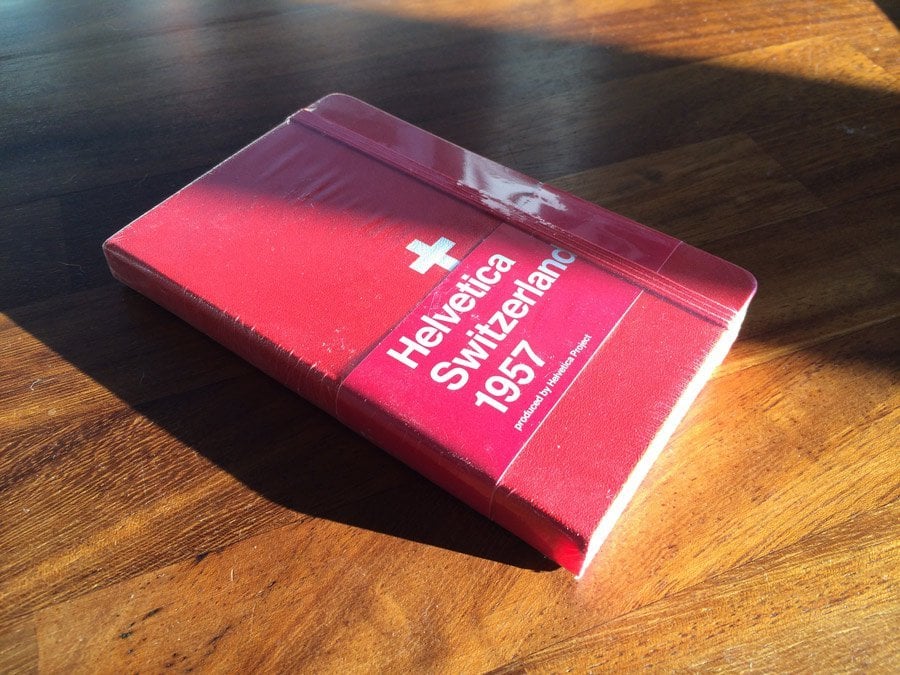
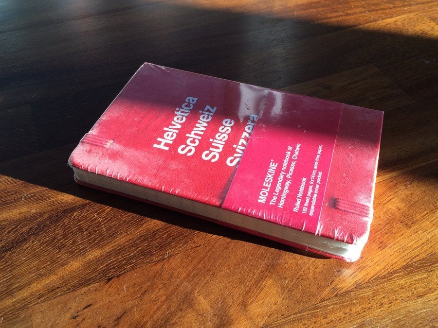
So here it is, The Helvetica Moleskine Christmas Giveaway has finally landed! I’ve been hanging on to these for a good few years now in the hope I might round to actually using them, but haven’t been able to bring myself to tear off the protective cellophane.

(Whilst you’re here: don’t forget to enter my other Christmas Giveaway for the rather cool, and useful: Slat Mobile Airdesk

So rather hanging onto these beautiful notebooks, I’ve decided to give’ em away (whilst still holding onto one black and one red Helvetica Moleskine for myself).

I have two black and one Red Helvetica Moleskine’s up-for-grabs, with two runner up prizes of Type Trumps.

Helvetica-Moleskine-Notebook-10

Helvetica-Moleskine-Notebook-11

How to Participate

  1. Leave your name in comments below.
  2. Any Google+ and/or Facebook Likes (found in my footer) would be appreciated, but not compulsory.
  3. As all my giveaways are completely self-funded, if you are able to visit one or more of my site sponsors (found top of my sidebar) this would be much appreciated: helps fund the giveaway, and others’ to come.
  4. One could also sign-up to receive my blog updates (newsletter) via email
  5. Maybe you might want to retweet the post, maybe you might not. Up-to-you…

That’s pretty much it.

Once I know who the winners are I will be in touch to arrange appropriate postage and packing. You can try leaving your colour preference for Moleskine in comments, but as there are only two red ones and one black one, you might just have to take what’s available.

Those scratches are just on the protective wrapping…

Helvetica-Moleskine-Notebook-12

Helvetica-Moleskine-Notebook-5

Helvetica-Moleskine-Notebook-5

Helvetica-Moleskine-Notebook-5

Read It’s Here! The Helvetica Moleskine Christmas Giveaway on The Logo Smith - forging logomarks of distinction since '86.

Classic Note-The Best iOS Note App in the Universe

$
0
0

iOS-Note-App-6

I really think this is the first time, in a long time, that I got so excited about installing a new iOS app (Classic Notes) on my iPhone. When I say excited I really mean just totally bonkers excited. This was another excellent offering from: GetApp

You don’t just get note taking capability either with Classic Note, you get a: Calculator, Fortune (random quotes) and Wrangler: Catch the DogCow, all accessed via the Tools menu

I’m going to use Classic Note for ever and ever…

Take your notes like it’s 1985. Classic Notes puts the days of one-button mice and 3.5″ floppy disks in your pocket, without breaking your back. On sale for a limited time! Follow us on Twitter at @ClassicNoteApp.

These really were the days, and having Classic Note on my iPhone is flooding my synapses with tidal waves of nostalgic endorphins. Want more good news? Classic Note is currently available for free on the Appstore.

You can send all your thanks to Digital Worlds Entertainment, and GetApp, for bringing you this most awesome gift.

iOS-Note-App-5

iOS-Note-App-4

iOS-Note-App-3

iOS-Note-App-2


Read Classic Note-The Best iOS Note App in the Universe on The Logo Smith - forging logomarks of distinction since '86.

Marrissa Tinkers Again? Flickr logo changes it’s colours

$
0
0

new flickr logo

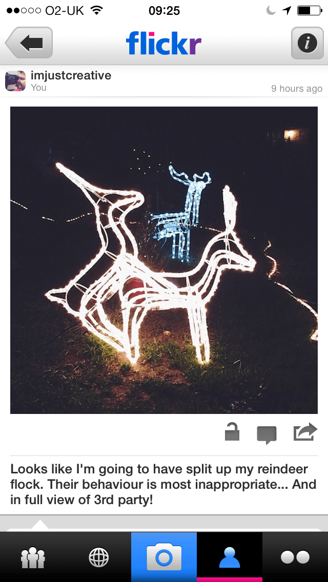
It’s not exactly breaking news this, but still, on a personal level, I do find things like this interesting. I really don’t have the foggiest idea if Marrissa was behind the flickr logo changing colours, or not: I’m just taking an educated guess.

I only noticed the colour changes when quickly looking at one of my flickr photographs on my iPhone (insincere apologies for the awfully rude photo). Blink and you’ll miss it. Not sure how widespread the implementation is because you mostly get the black and white logo on the main website.

photo

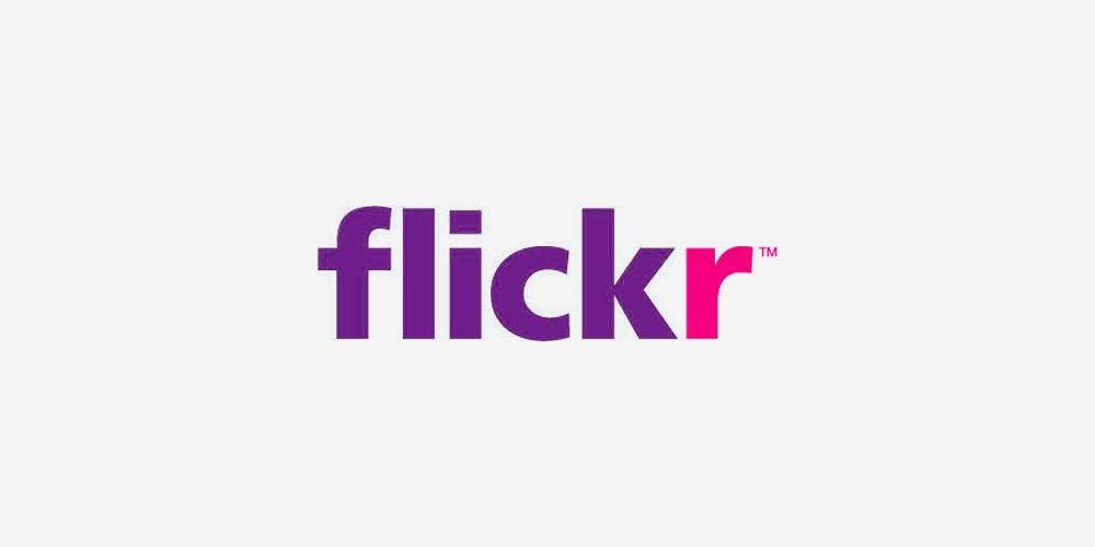
Just seems a silly little change really, the introducing of Yahoo’s purple. A token gesture (as well as moving the magenta to the dot on the i), if I ever did see one, that doesn’t really work. Now it just looks like an amateur attempt to keep the best of both worlds, and it didn’t work. Better to just bite-the-bullet and go ‘large’.

Might be just a small thing to some, but these ‘small things’ can wreck havoc on a brands heritage. Yahoo just tinkers…

Thus, another possible option (below), just to simply keep it to 2 colours, might have been to simply change the blue for the purple, and keep the magenta ‘r’ as always. This way you get more of the Yahoo branding across whilst still keeping the distinctive ‘r’.

The purple is more dominant, the overall style is still the old flickr, but it looks a little cleaner and a less messy ‘compromise’.

new flickr logo 1

No idea what they might be thinking, or planning for the future, so no one can say if this is a precursor to something more substantial, but I don’t like it.

It’s a small detail, but a detail nonetheless.

Given they seem to be liking the gothic look on flickr’s main website, might have been better to simply monochrome the logo in it’s entirety and be done with it!

When you think about it, there are many variations one could do, and that’s part of the problem with Yahoo, they seem to change for the sake of change because they ‘can’ change. Yet they can’t seem to make these changes in a way that’s coherent, adheres to some uniform plan, and in the end they end up diluting once strong, and somewhat iconic, brands.

Sound familiar?


Read Marrissa Tinkers Again? Flickr logo changes it’s colours on The Logo Smith - forging logomarks of distinction since '86.
Andrew Wendling makes Famous Brand Logos MUCH MUCH Bigger

$
0
0

pepsi-big-logo

ge-big-logo

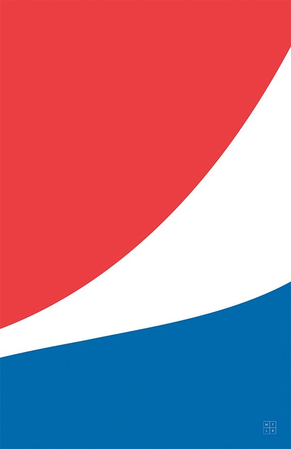
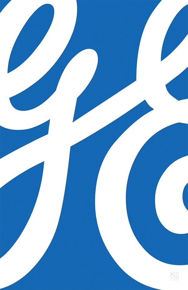
http://make-the-logo-bigger.tumblr.com: I just adore little logo projects just like this one by San Francisco-based art director and designer, Andrew Wendling.

This is a cool logo study into how easily we can tell whose tightly cropped logo belongs too, often just from the brands signature colour.

It’s, of course, a hook, the whole titled: “Make the logo bigger”, but whatever, you’re here or you’re elsewhere, reading about what Andrew has done on his Tumblr blog.

The ubiquitous Tumblr is a perfect blogging platform for these side-projects, and Andrew has used it as a platform to poke little bit of fun at the whole “make the logo bigger” stereotype.

Not just intent on making them bigger, he has enormousized each logo until only a portion of the design is visible.

pengiun-big logo fedex big logo coke big logo apple-logo


Read Andrew Wendling makes Famous Brand Logos MUCH MUCH Bigger on The Logo Smith - forging logomarks of distinction since '86.

Viewing all 114 articles
Browse latest View live


Latest Images