I love me some Brand Identity Guideline Resources and you will see that in the past I have featured a variety of such brand book guidelines covering:
I keep searching for other prime examples of branding books, corporate guidelines, identity guides, and through out these searches I often stumble across some nice examples, but not examples that provide the WOW factor.
The WOW factor is more of personal opinion rather than a scientific method of assessing WOW from NON-WOW, but usually based on what I also feel other people will take note of.

The Bulging Sack of Brand Identity Guideline Resources is a collection of branding and identity guidelines resources that I have collected over time that will hopefully keep you busy for a short while. A few are a few years old, and you have likely seen around, but I also think a few could be new to you.
Massive thanks to Sasha Agapov @agapov for reaching out to me, and sending me CISCO, Best Buy and Ford brand guideline.
Bulging Sack of Brand Guideline Resources
The Oxfam Brand Book


Download The Oxfam Brand Guidelines
The Jamie Oliver Brand Book


Download Jamie Oliver Brand Guidelines Book
New York City Transit Authority Graphics Manual


View more photos of the New York City Transit Authority Graphics Manual
Found via Swiss Legacy
The Best Buy Brand Book


Download the Best Buy Brand Guidelines
The Ford Brand Book


Download the Best Buy Brand Guidelines
The Barbican Brand Guidelines


Download The Barbican Brand Guidelines
Found via AisleOne
The FearNet Brand Book


Download The FearNet Brand Book
The Easy Group Brand Manual


Download The easyGroup Brand Manual
Found via LogoDesignLove
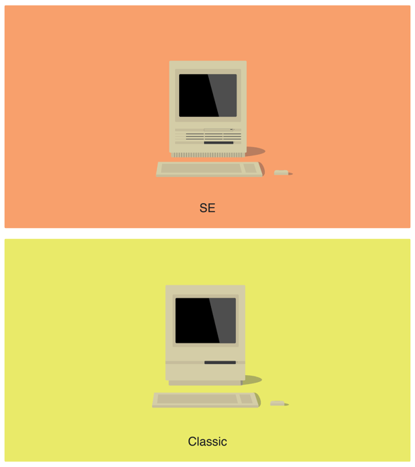
Apple Identity Guidelines


Download Apple Identity Guidelines
The BBC GEL Styleguide


Download the BBC GEL Style Guide
Seagate Corporate Style Guide


Download the Seagate Corporate Style Guide
Vintage McDonalds Specification Manual
![]()
![]()
View more on Vintage McDonalds Specification Manual
The Propellerhead Brand Manual


Download the Propellerhead Brand Manual
The F-Secure Brand Identity Guidelines


Download the F-Secure Brand Identity Guidelines
The Skittles Brand Book


Download the Skittles Brand Book
Found via Couldal
Other Brand Guideline Resources
So as well as all those don’t forget I have featured the following brands on imjustcreative: Skype, I Love New York, FourSquare, Adobe, Sony Vaio, CISCO, Santa Claus, The Nazis and even Vintage NASA (part 1 & part 2).
Buy a Brand Book?
If you have some spare dosh you could head over to Blanka and buy some printed brand books with brands such as First Direct, Barbican and RAC.


Brand Guideline Links
Designing Style Guidelines For Brands And Websites - Smashing Magazine
Guidelines And Standards Manuals - IdentityWorks
Brand Identity – Computer Arts
List of Corporate Brand Guidelines – DesignersTalk
Single Page Logo Guideline Template – imjustcreative
Four Page Logo Guideline Template – imjustcreative
Online Brand Guidelines
Some companies don’t feel the need to create a brand book and so create a simpler online version. Penguin Logo Guidelines is one such example.

Brand Guideline Books
These are a few books on brand identity that I can highly recommend after having read them myself.
Book Overview: Brand Identity Essentials by Rockport
Logo Design Love by David Airey
Designing Brand Identity byAlina Wheeler
Wally Olins: The Brand Handbook by Wally Olins
On B®and by Wally Olins
The New Guide to Identity by Wolff Olins
Bonus Branding Book


The Pepsi brand book is really good for a giggle. Have to wonder what planet the design team/person was on when this was conceptualised, but regardless of home planet they certainly have a wicked sense of humour. Practical joke time.
Download the Pepsi Brand Book
Read Bulging Sack of Brand Identity Guideline Resources on imjustcreative - logo & brand identity design portfolio and blog.